Circus of the City

Circus of the City was a hypothetical Melbourne New Festival pitch for Branding class.
In this project, I completed the:
Market Research & Competitor Analysis
Strategy & Brand Positioning
Art Direction
Logo Development
Style Guide
Motion Design
Mockups & Deliverables
Art Direction
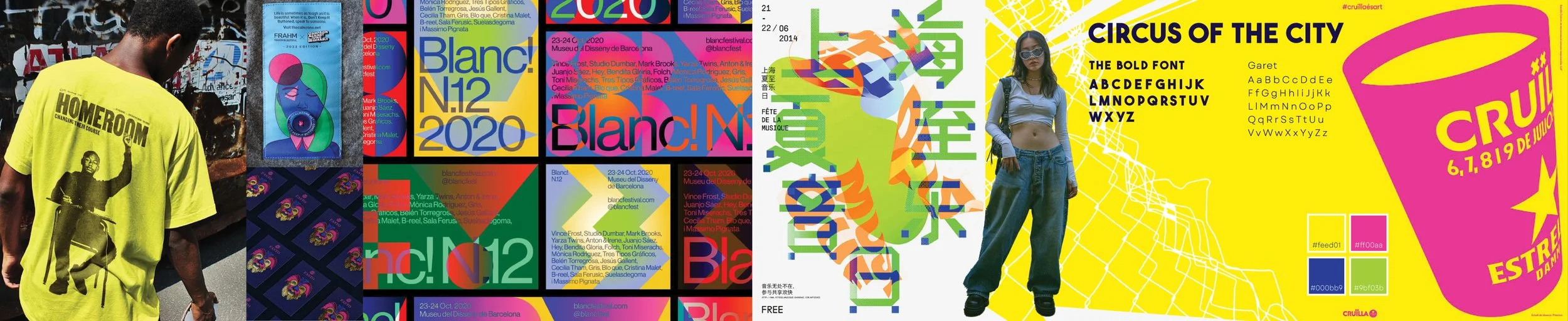
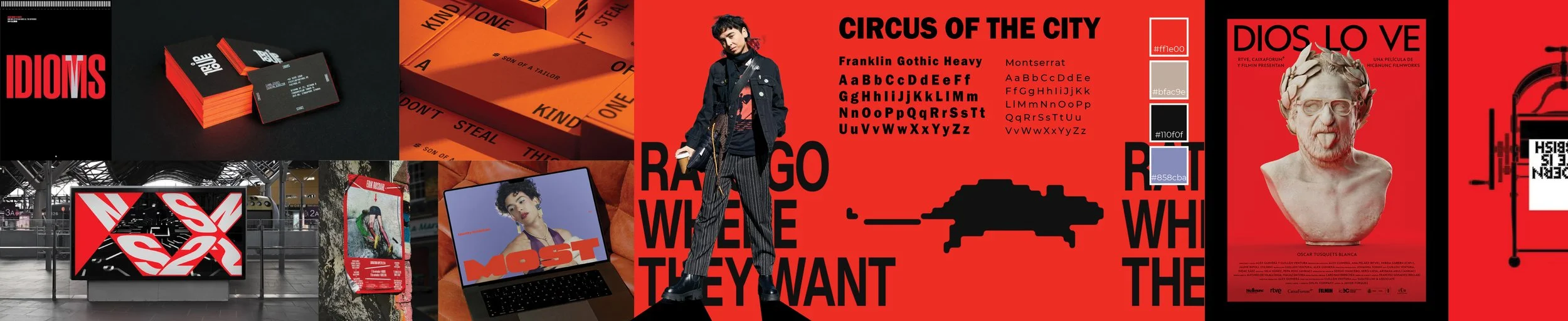
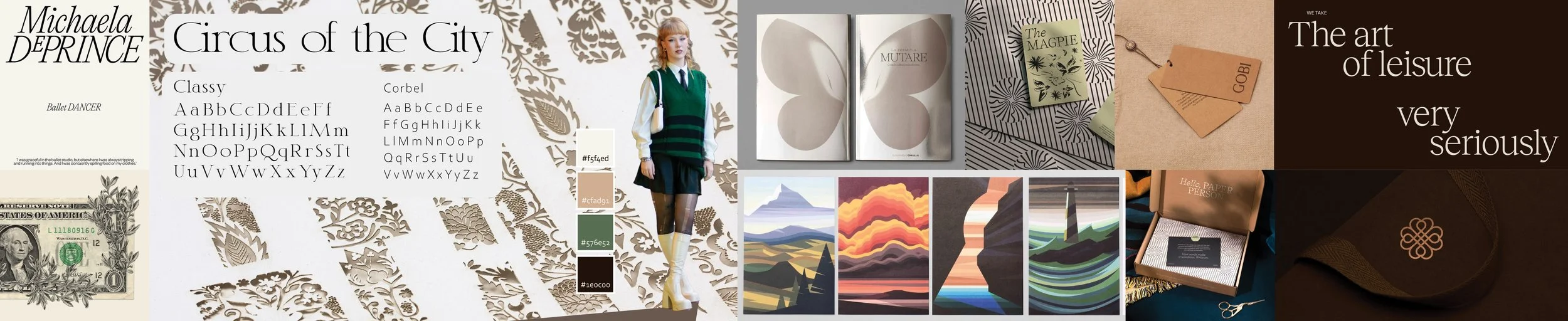
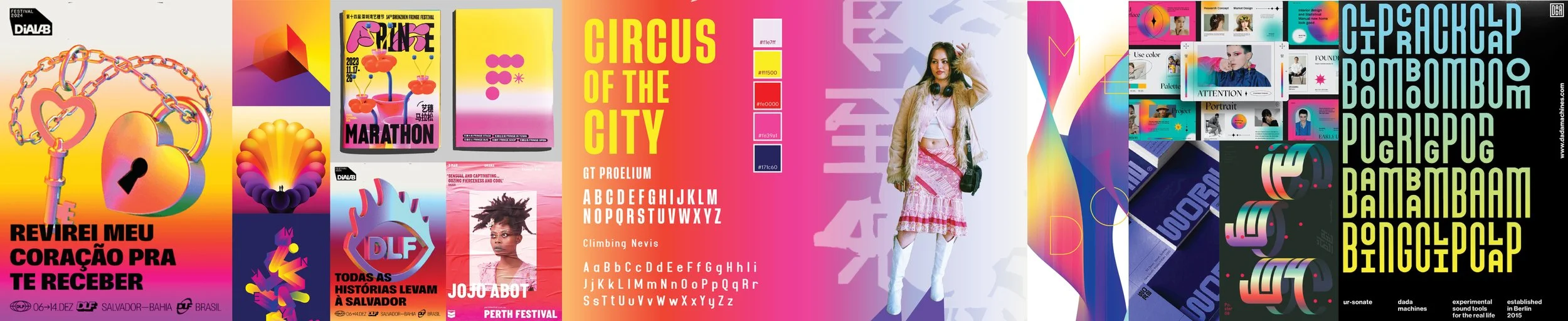
4 stylescapes were created in the early art direction development stage to pinpoint the visual character of the festival and determine what the target audience would be most inclined towards. It was important that these stylescapes were visually distinct and brought the concept in different potential directions, better allowing me to determine which direction suited the character of the festival best.
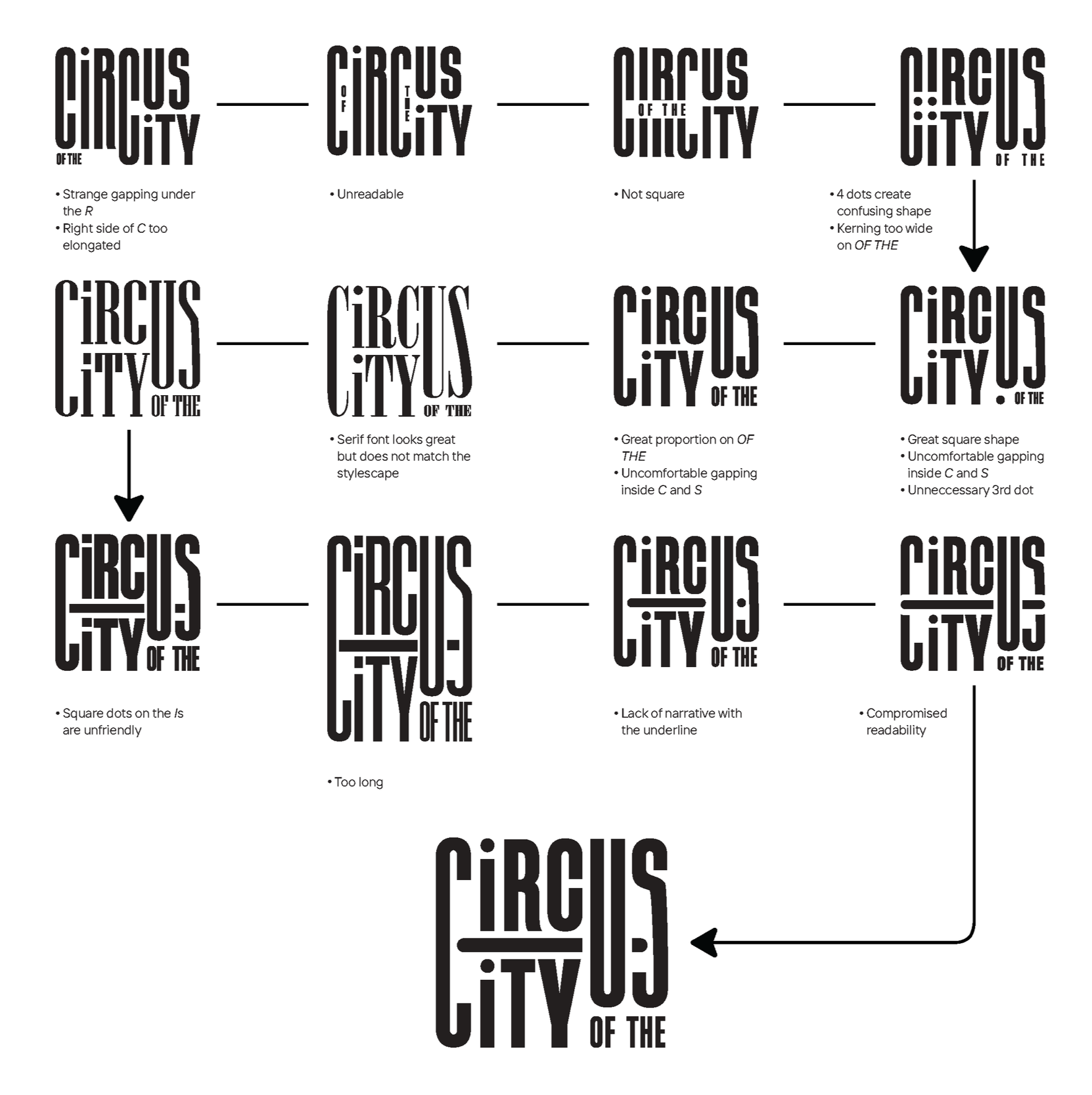
Logo Development
Initial concept sketches were done by hand and included experimentation with the shape of the letters making up the logo, the relationship betwen the title ‘C’s and exploration of potential related imagery.
Early on, it was evident there was a significant relationship between the first ‘C’s in both ‘Circus’ and ‘City’ and initial attempts saw the emphasis placed on the curves in the ‘C’s letterform.
Further developments were carried out in Adobe Illustrator, making adjustments to the balance of the wordmark until it looked neat and even.
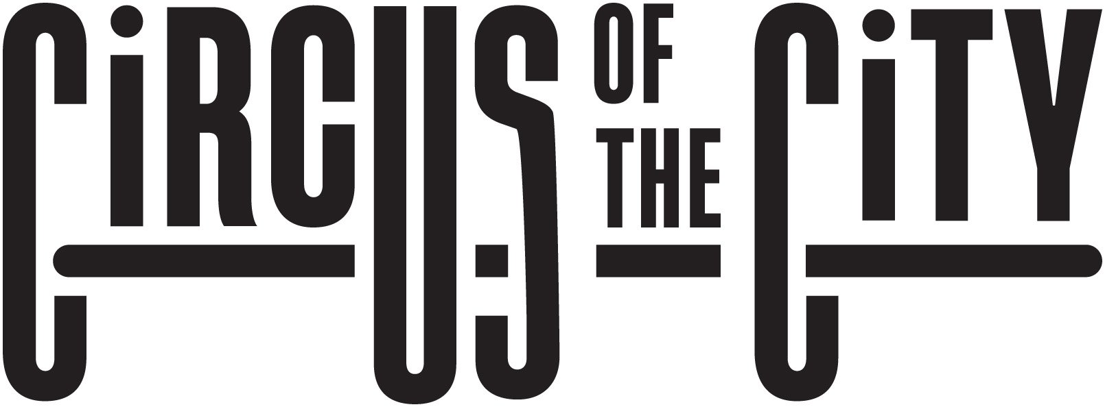
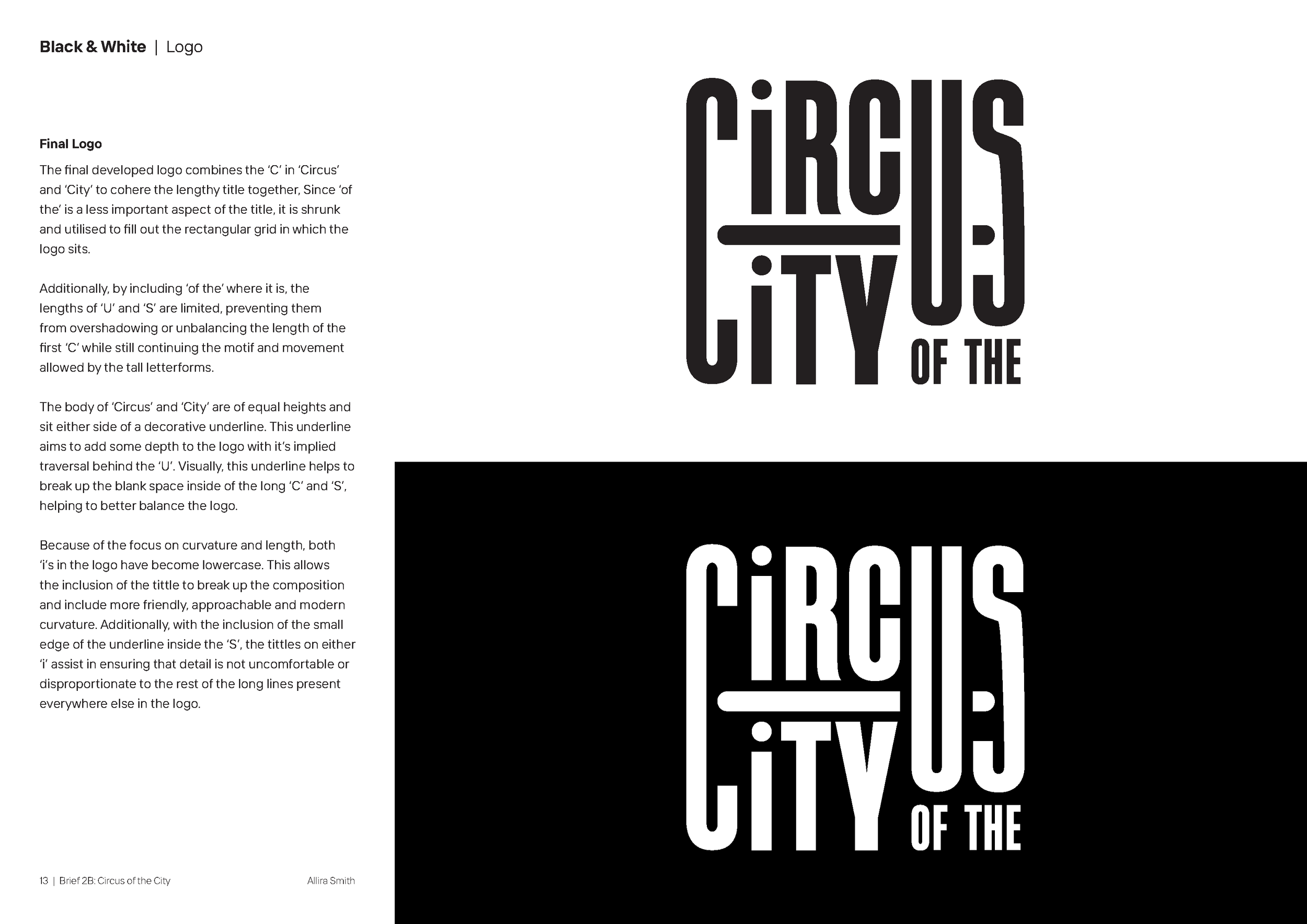
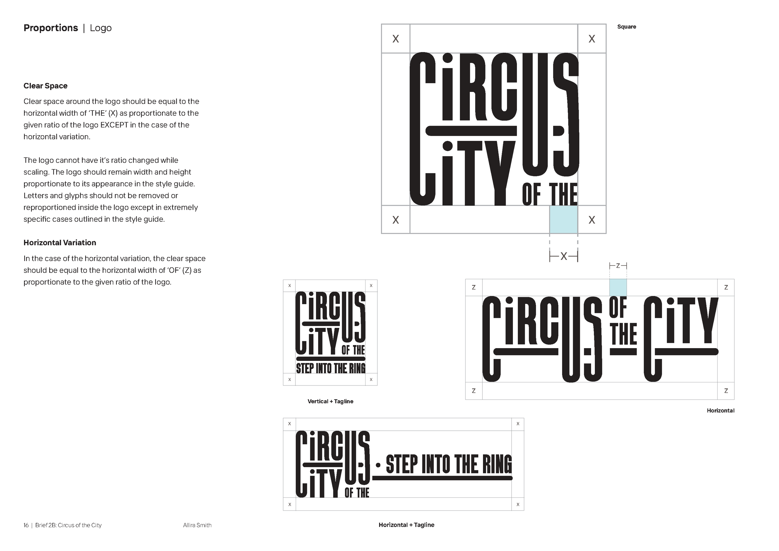
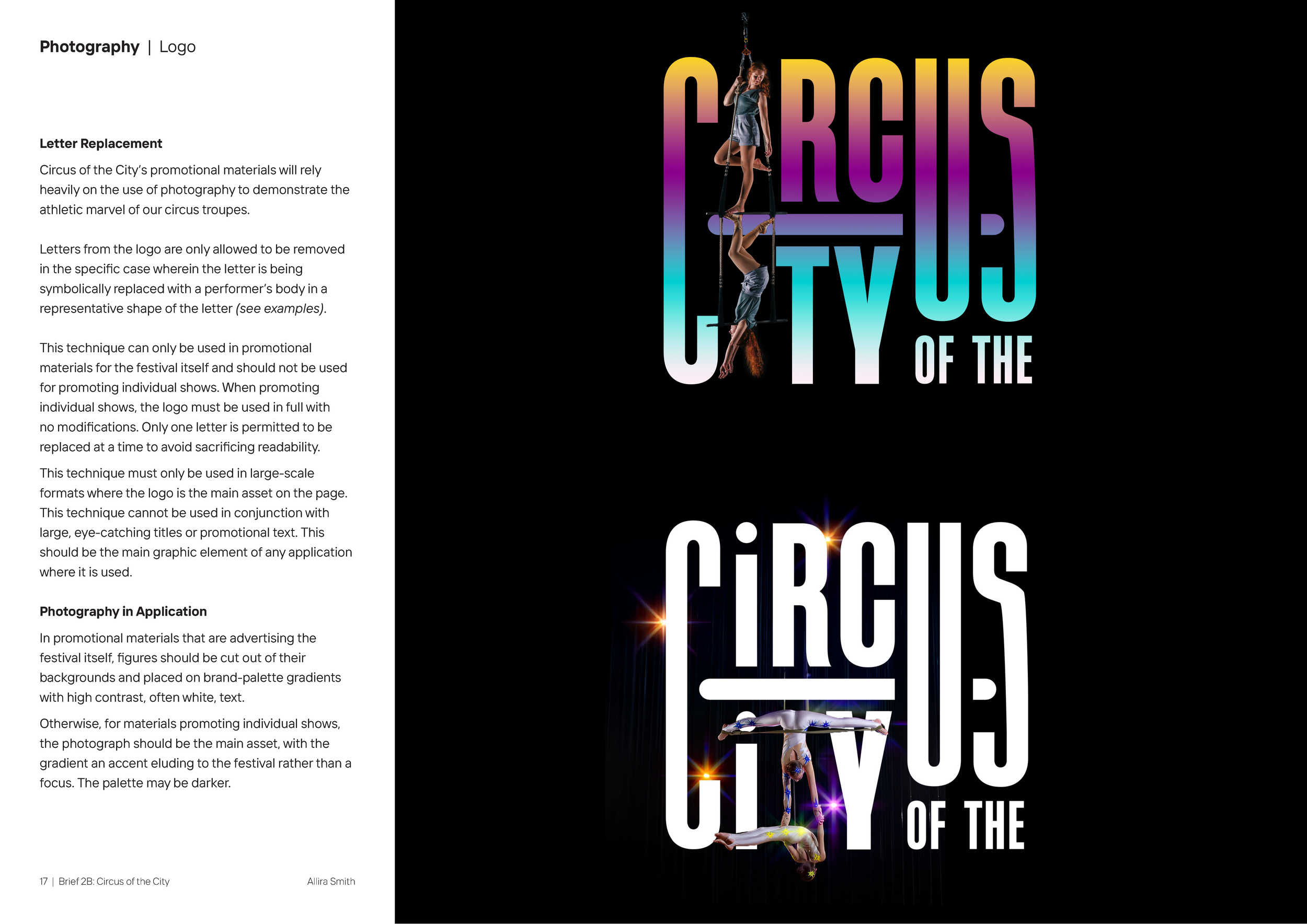
The final developed logo combines the ‘C’ in ‘Circus’ and ‘City’ to cohere the lengthy title together, Since ‘of the’ is a less important aspect of the title, it is shrunk and utilised to fill out the rectangular grid in which the logo sits.
Additionally, by including ‘of the’ where it is, the lengths of ‘U’ and ‘S’ are limited, preventing them from overshadowing or unbalancing the length of the first ‘C’ while still continuing the motif and movement allowed by the tall letterforms.
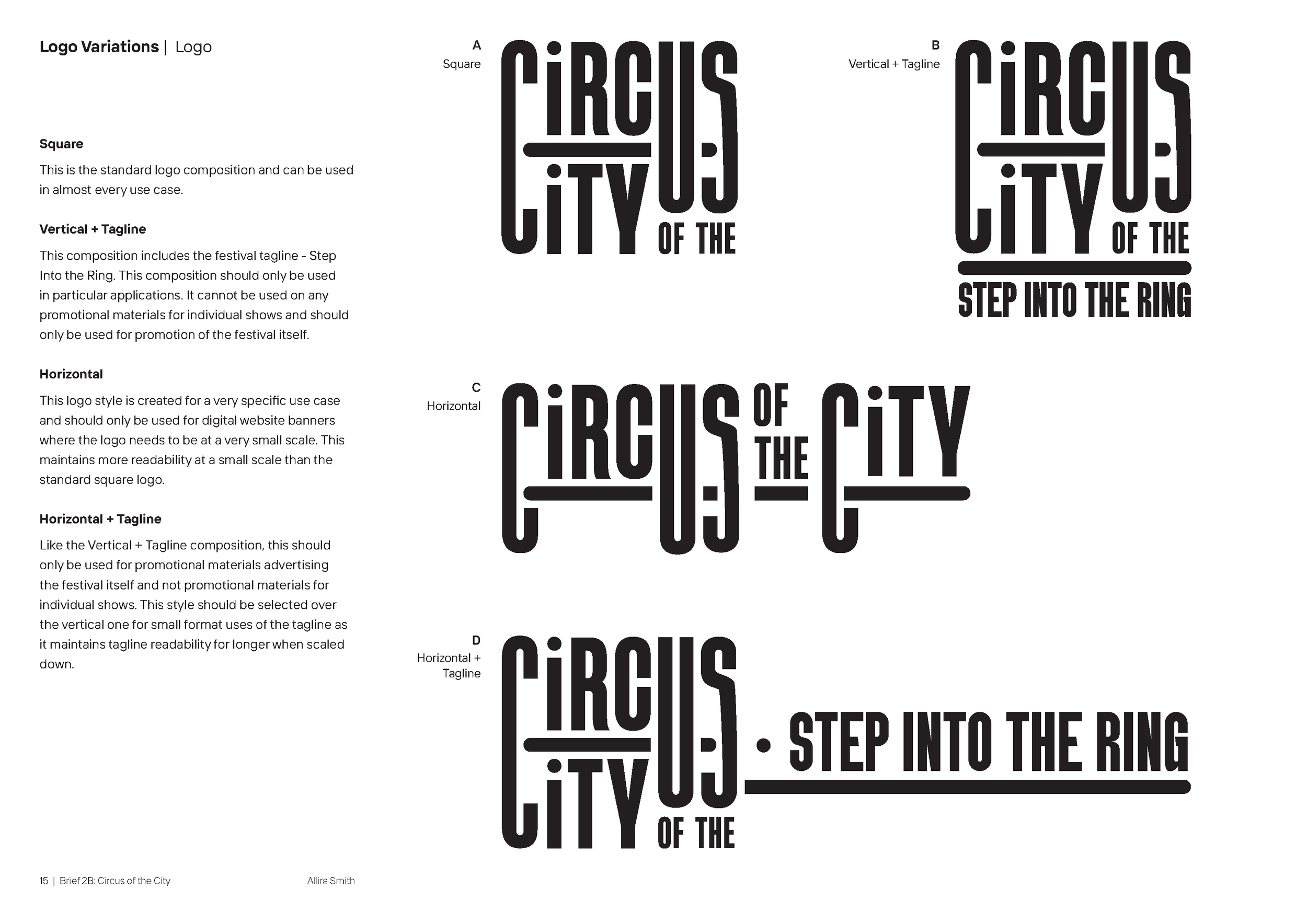
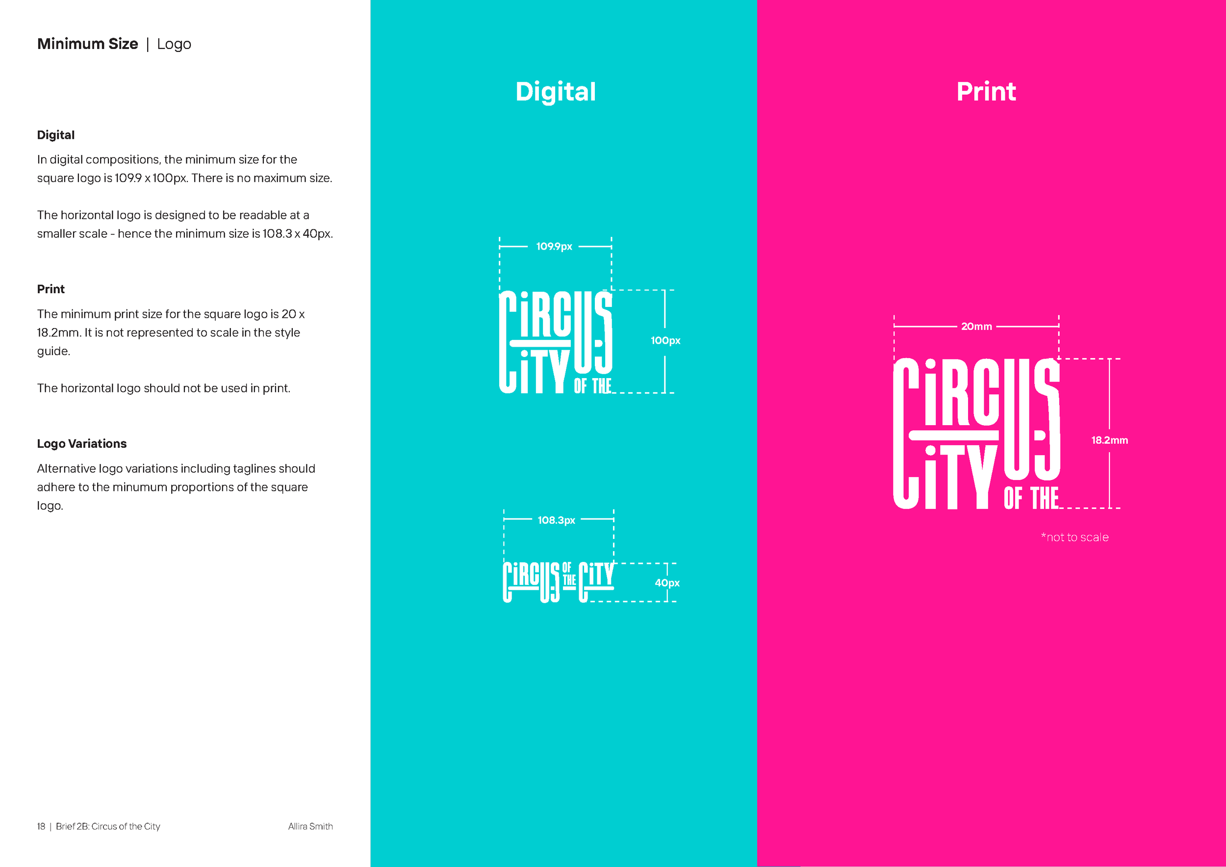
Horizontal Logo Variant designed for small format digital applications
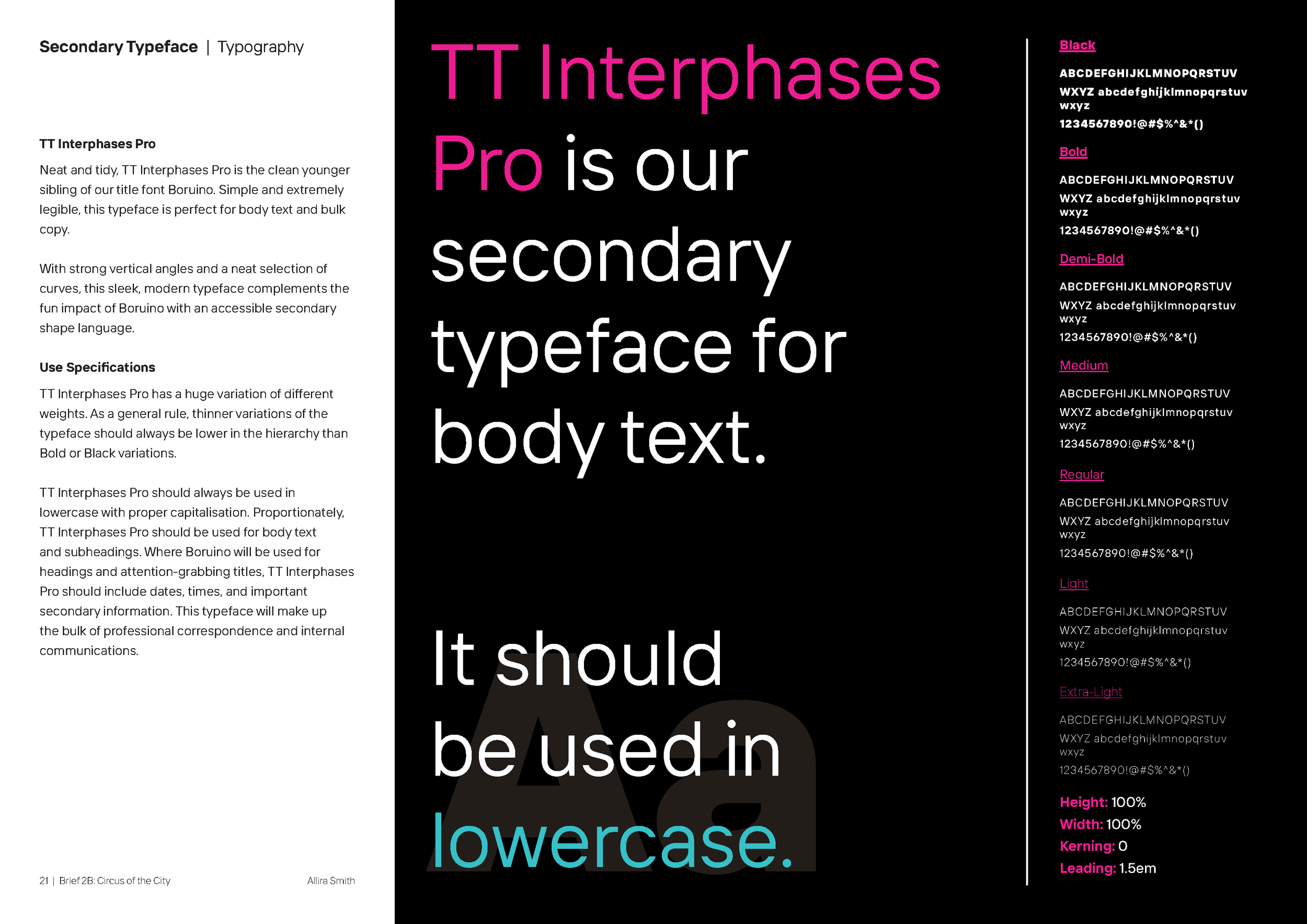
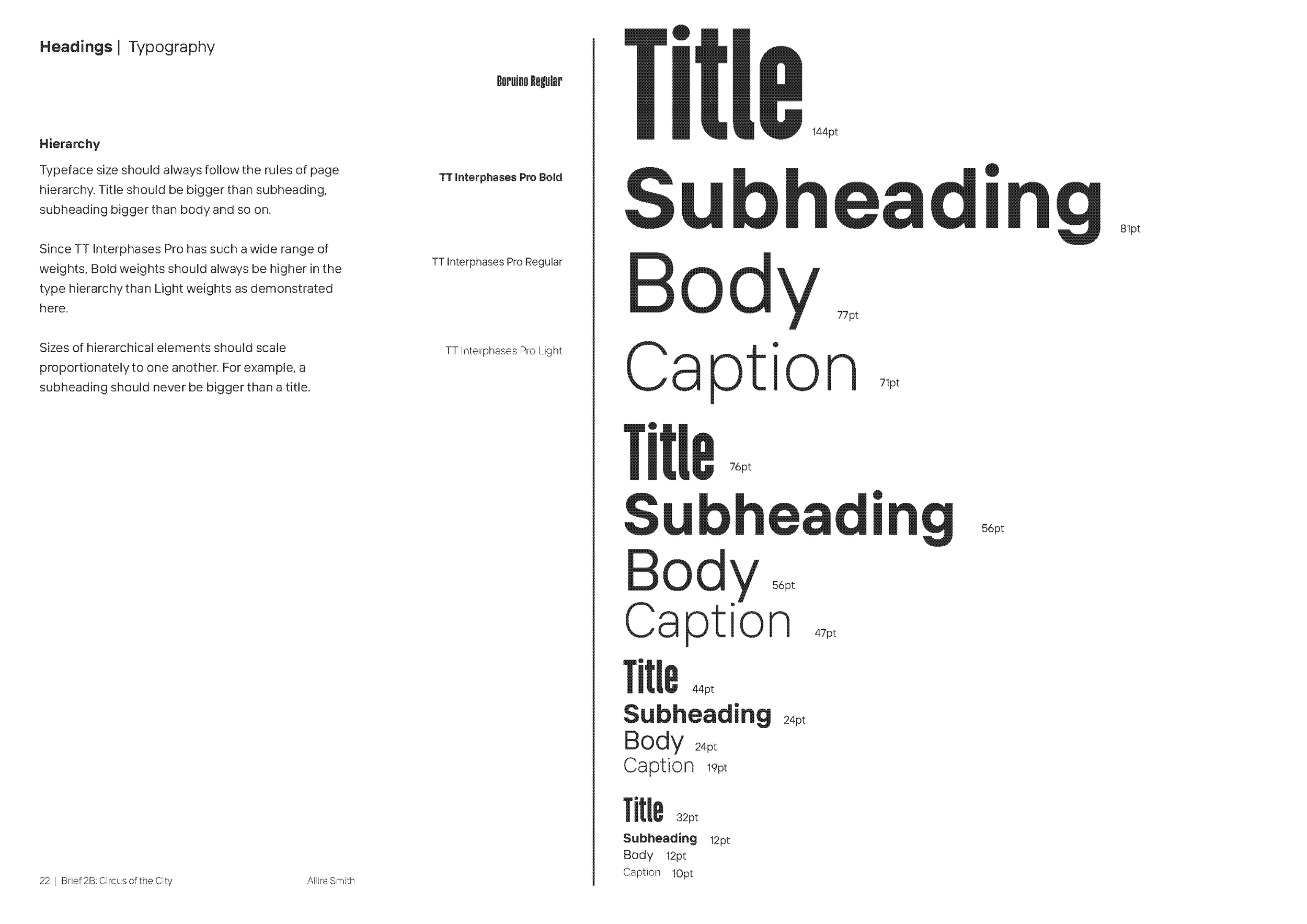
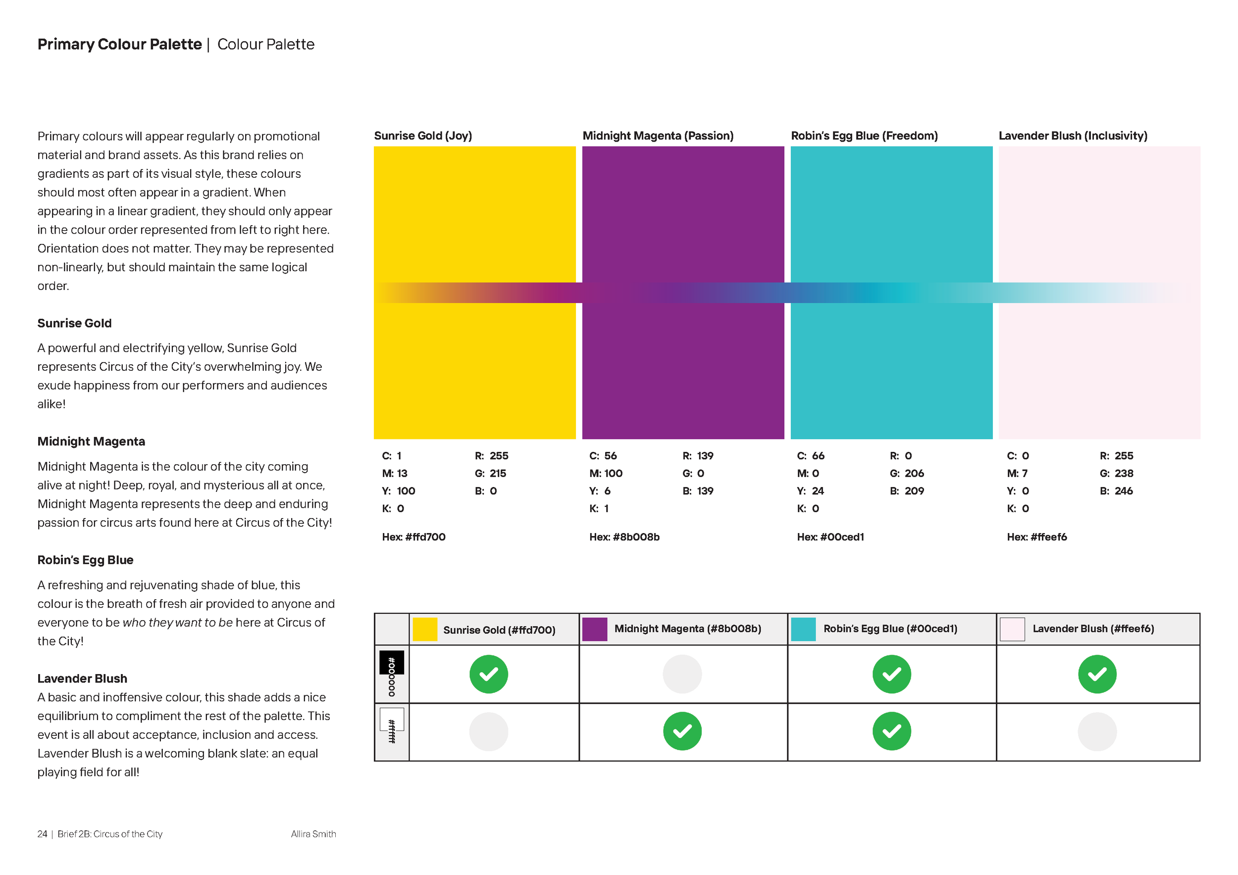
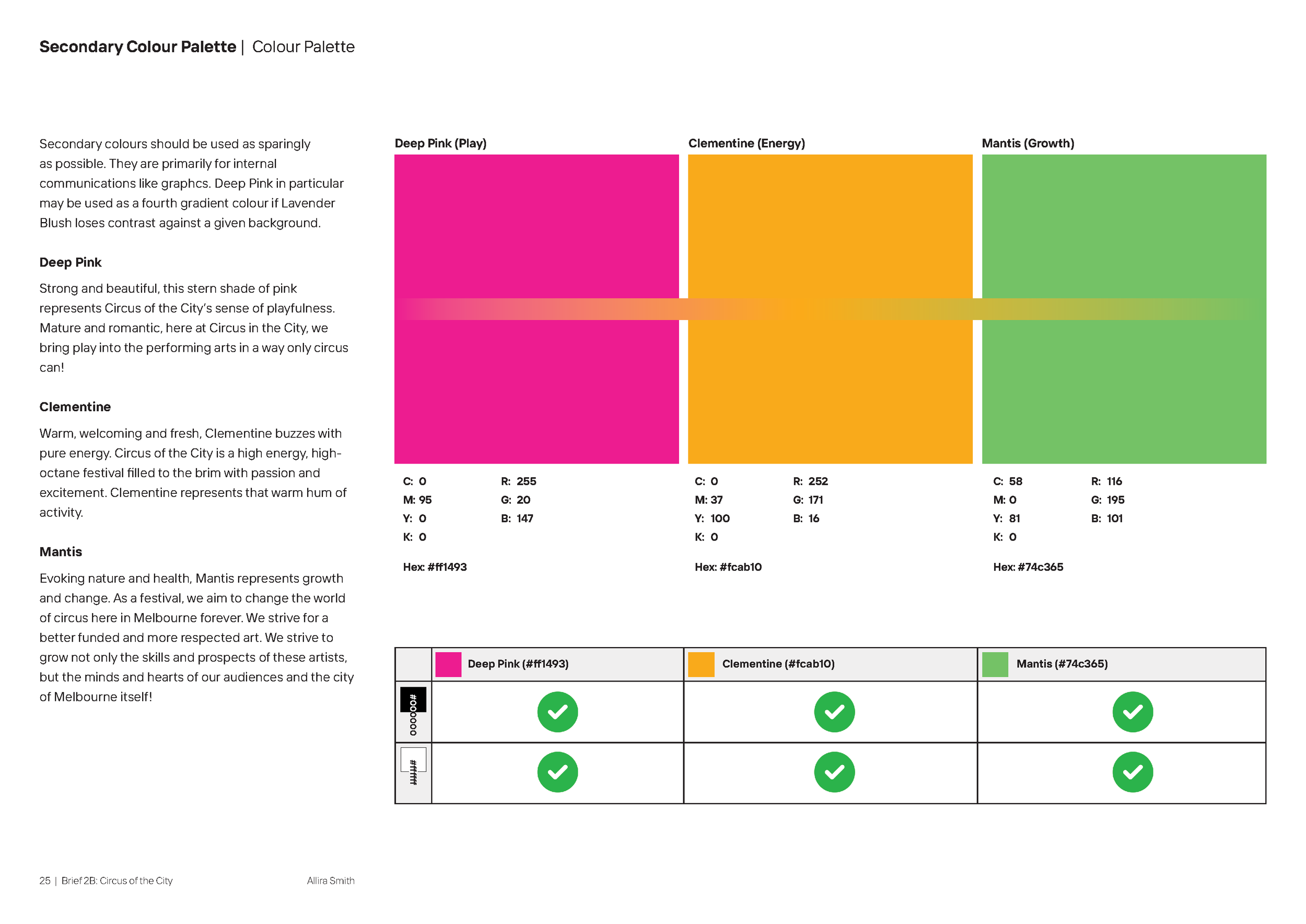
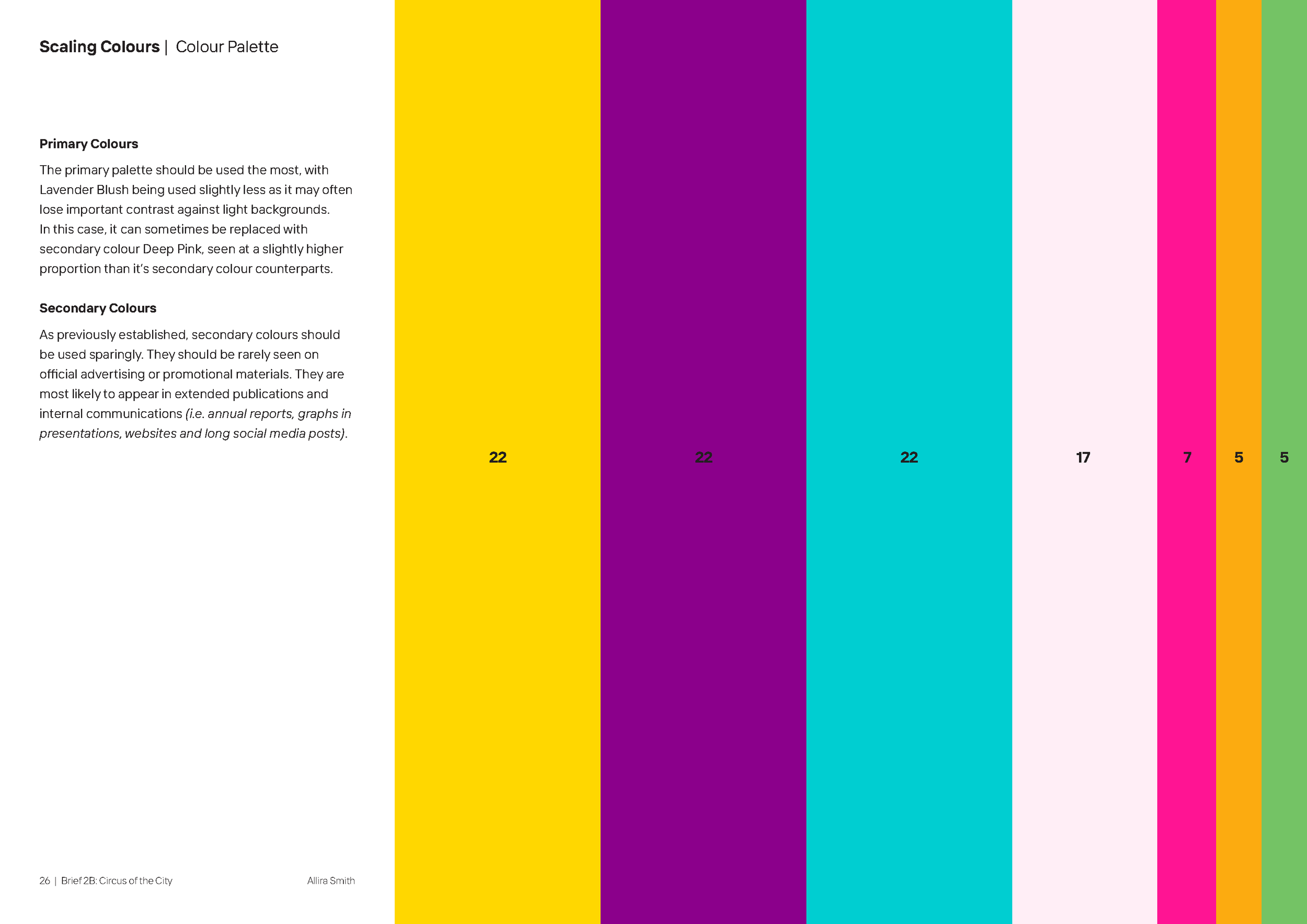
Style Guide
Style guide development outlined the rules and regulations of the newfound style of Circus of the City. As a detail-oriented and scientifically-minded designer, this was one of the most enjoyable parts of the design process. Turning the brand I had created into a followable set of rules and guidelines.

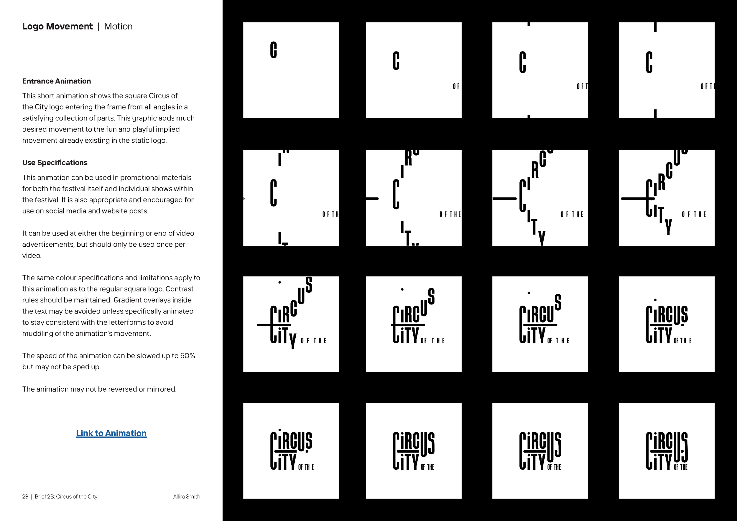
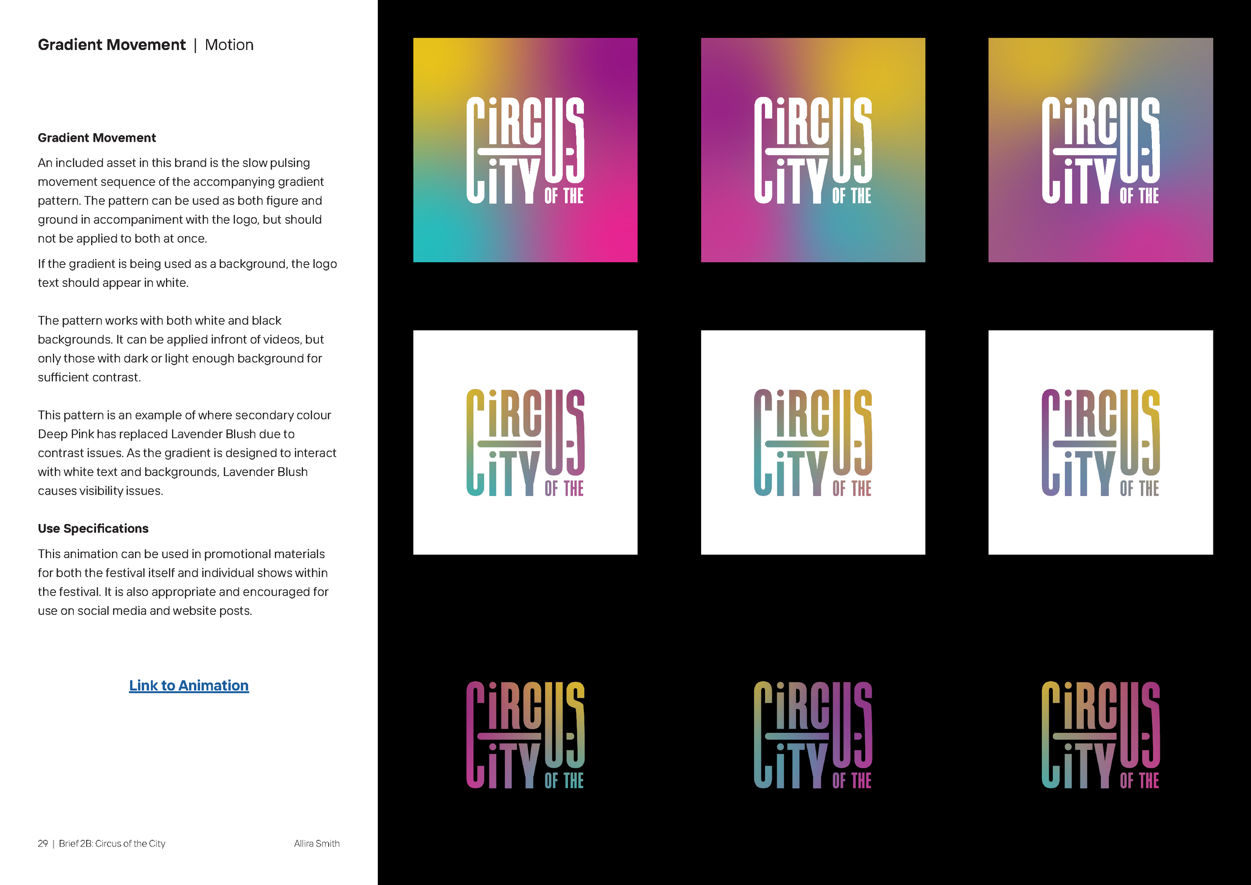
Motion Design
With this project, I created 2 demonstrative motion design elements to compliment the brand identity and give Circus of the City a more engaging digital footprint. These graphics included a logo construction animation and a subtle gradient movement that could accompany other graphics to create interest and engagement.
Creation of these elements involved use of Adobe After Effects and Premiere Pro.
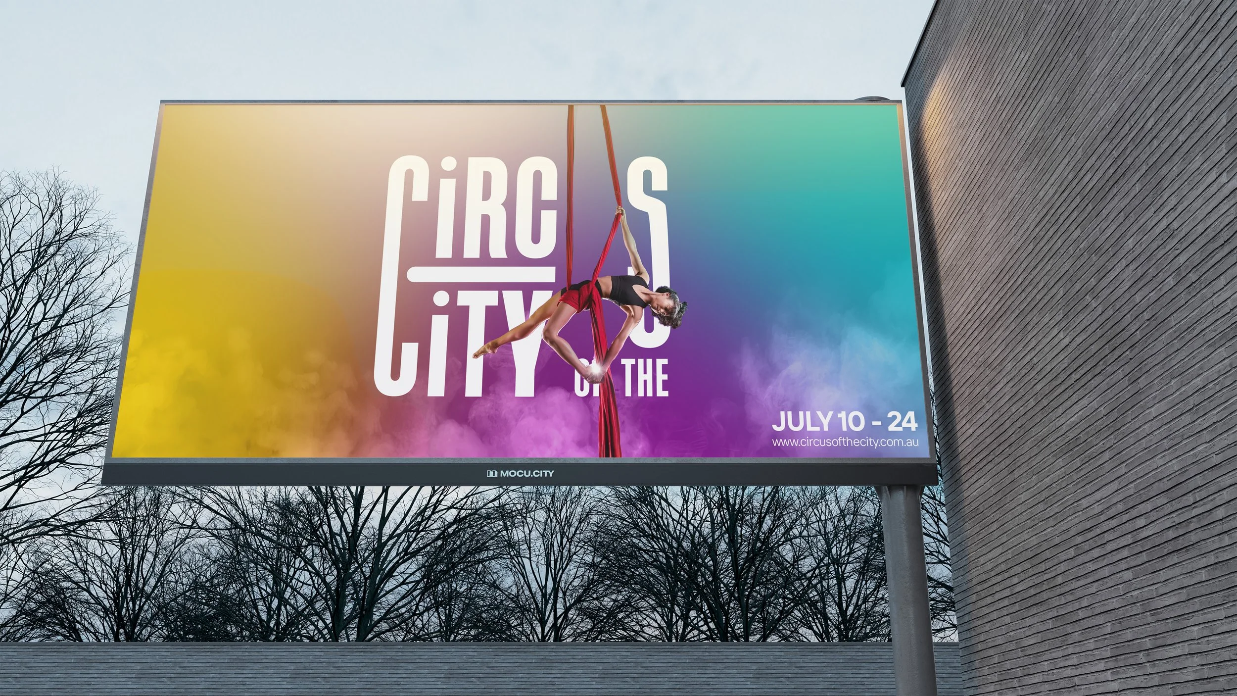
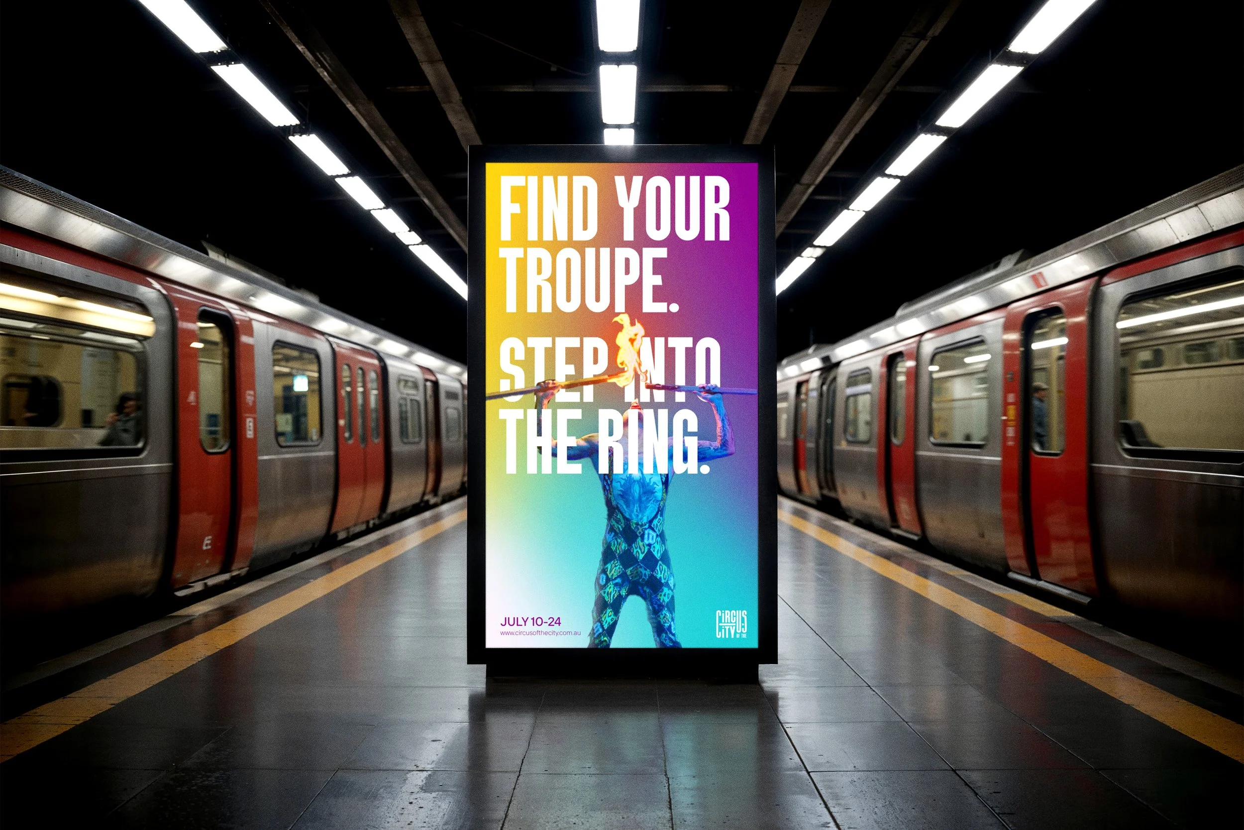
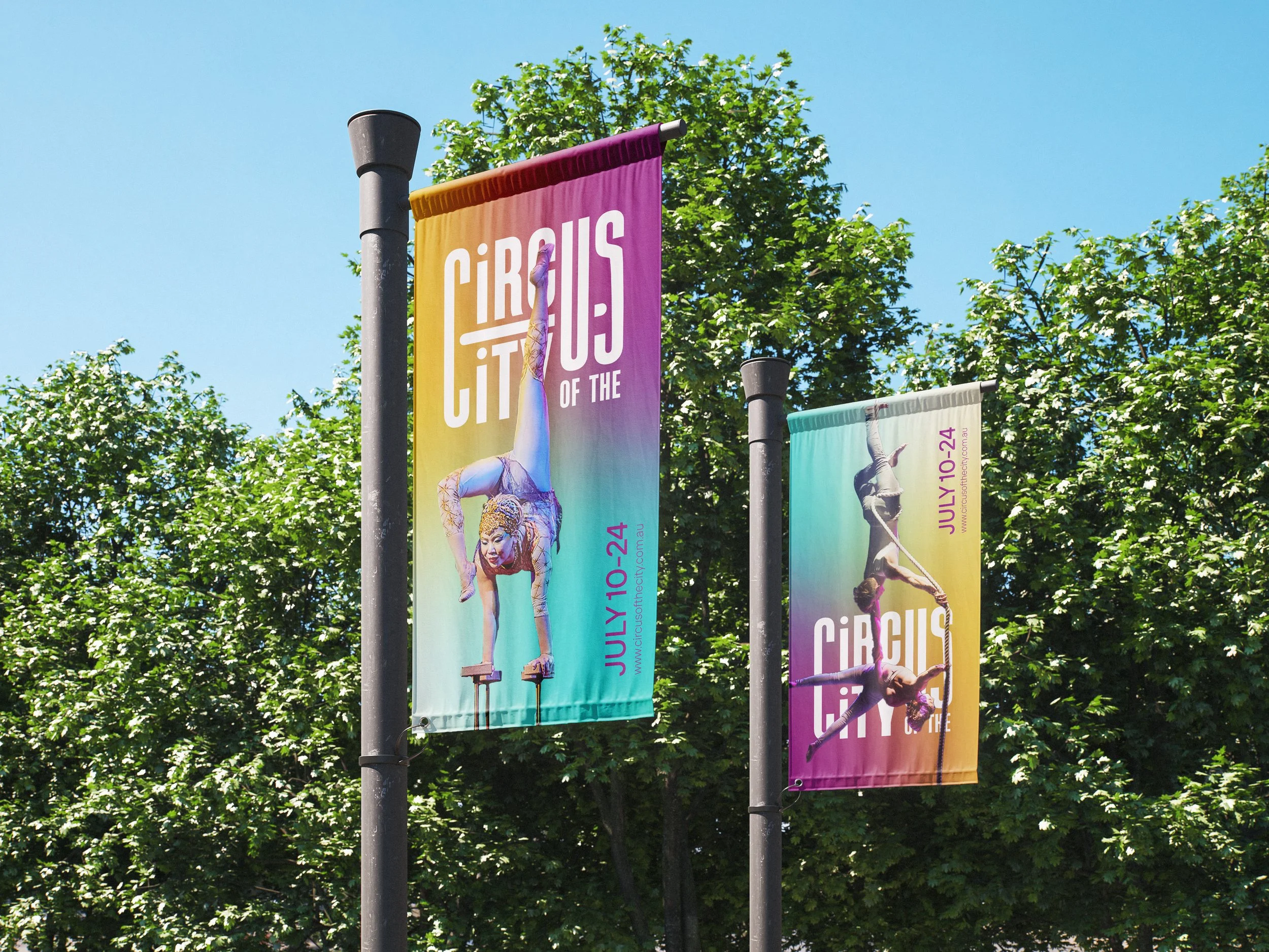
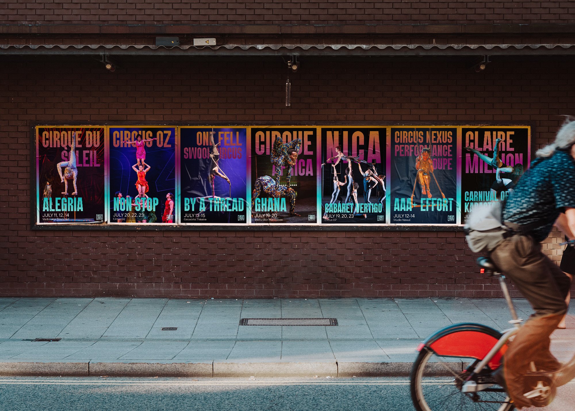
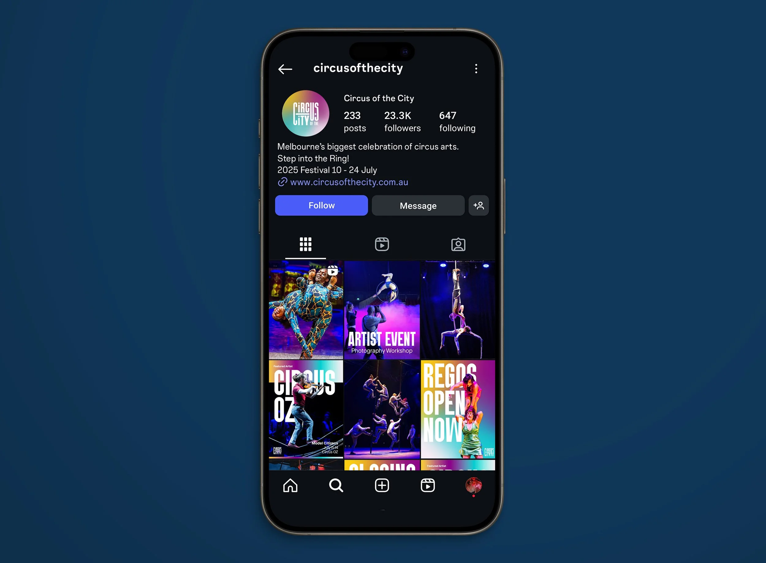
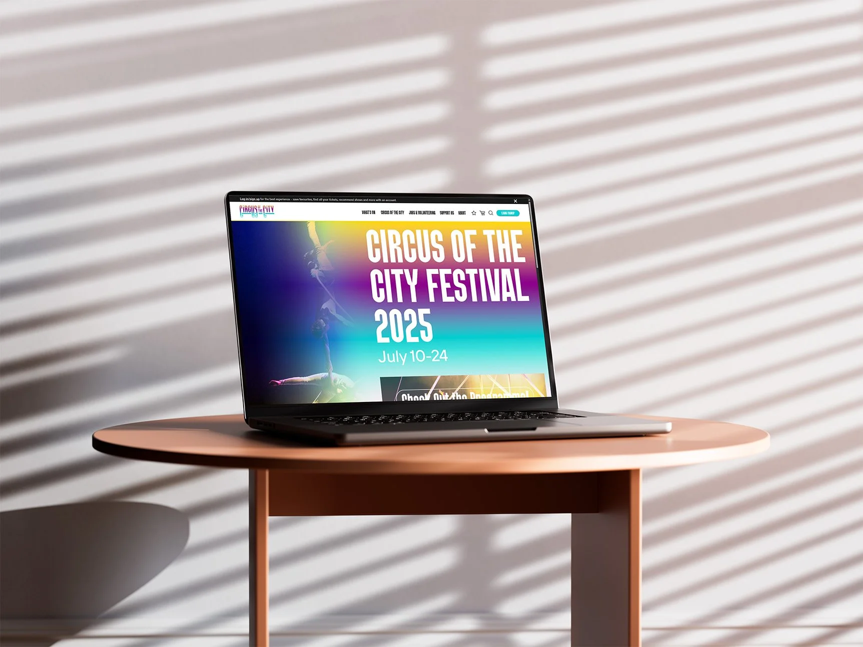
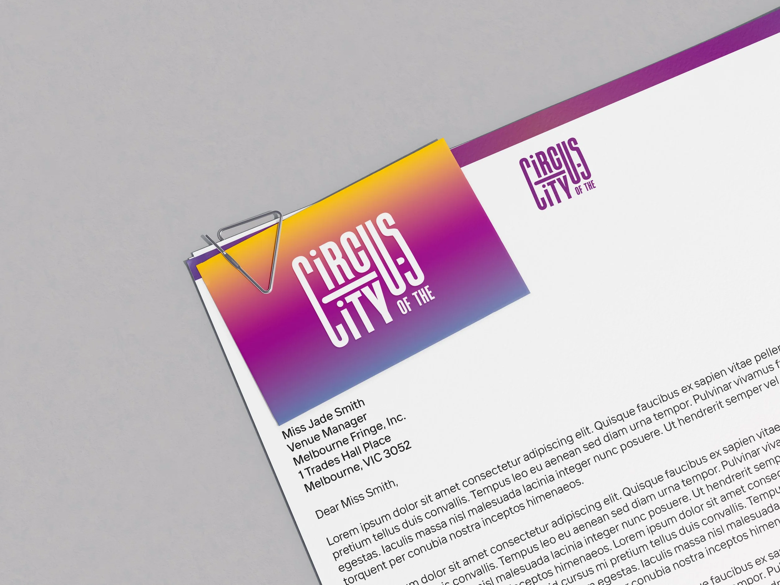
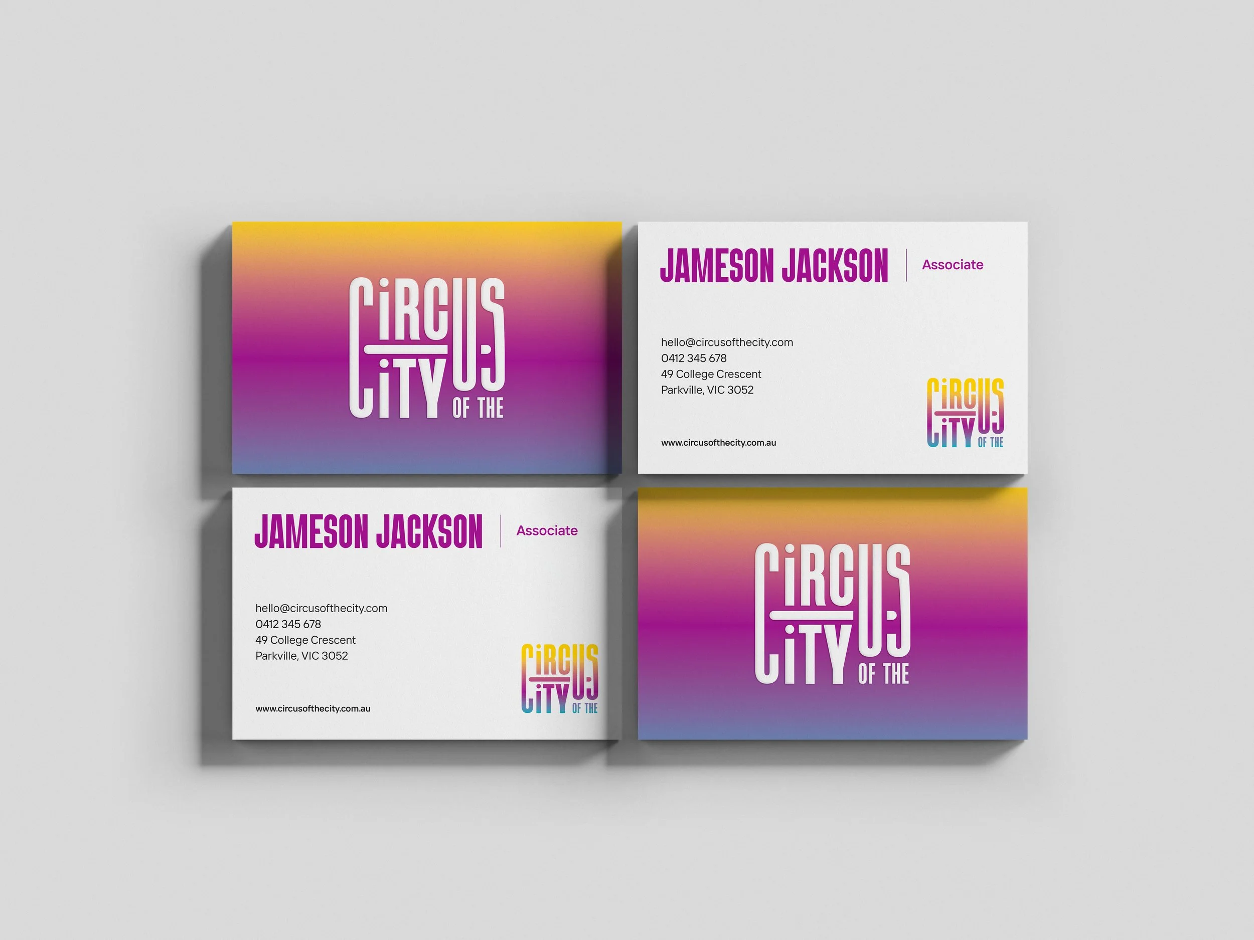
Mockups & Deliverables
High-quality mockups and poster designs demonstrate the effectiveness of this flexible brand identity in the real world. With a flexible, yet easy to follow style guide, and a timeless logo and colour palette, this festival identity could be used time and time again for years to come!