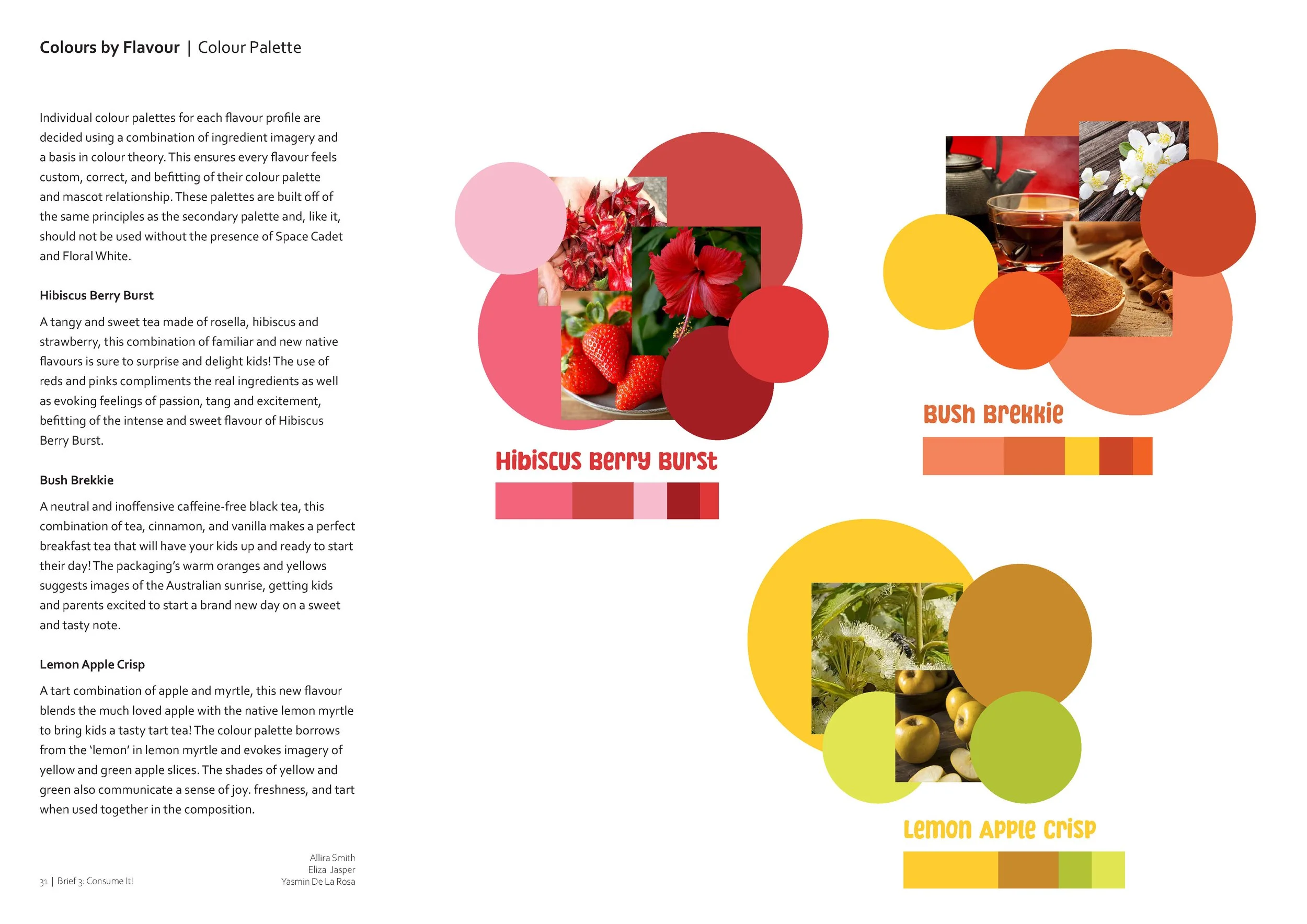
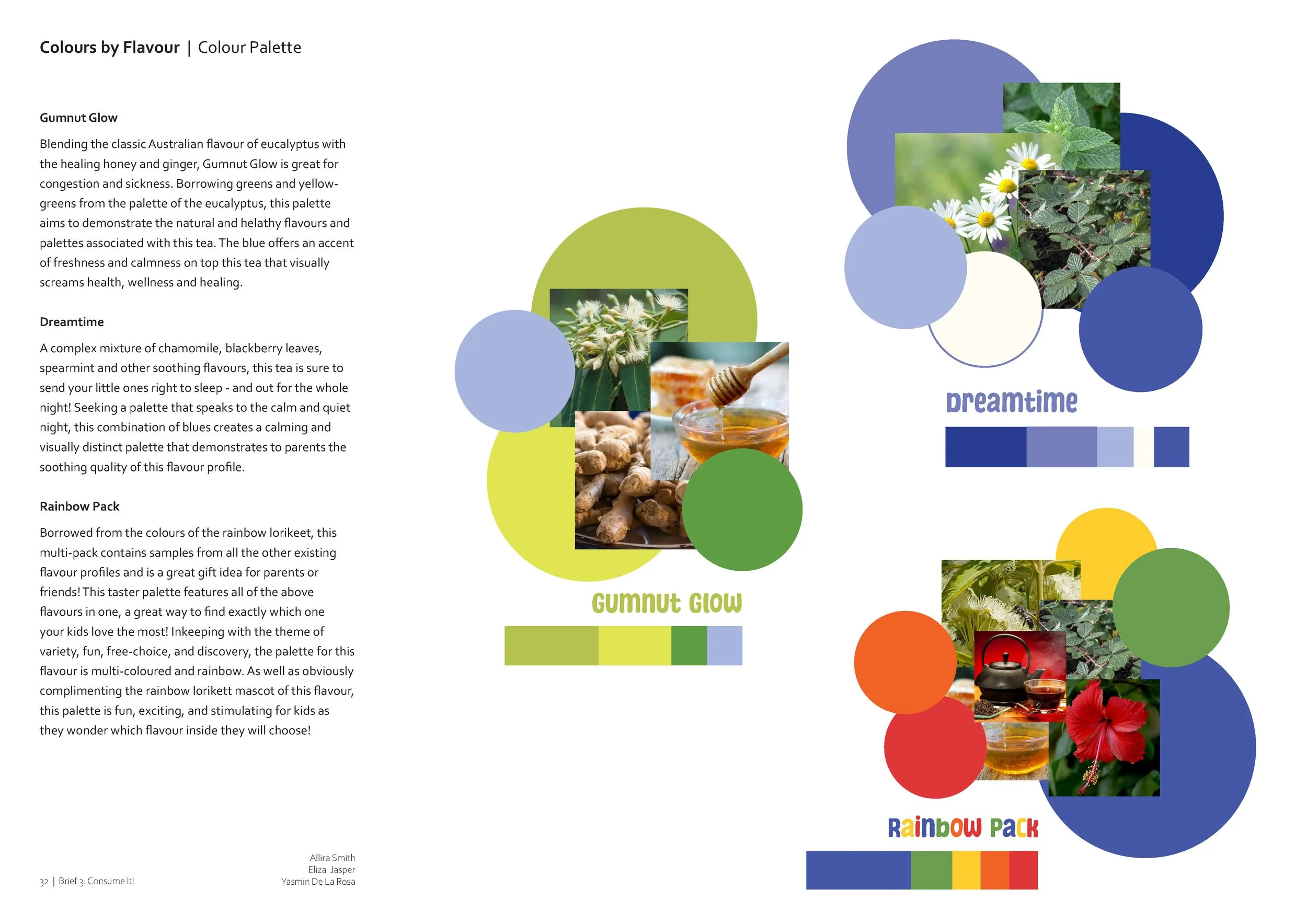
Little Sips
This project was made in collaboration with Eliza Jasper and Yasmin De La Rosa Sutedja.

In this project, my groupmates Eliza, Yasmin, and myself collaborated to create a consumable market product, based in the specialised areas of health and sustainability foods.
In this project, I was personally responsible for:
Market Analysis & Positioning
Competitor Analysis
Mascot Development
Illustration
Logo Development
Style Guide Creation
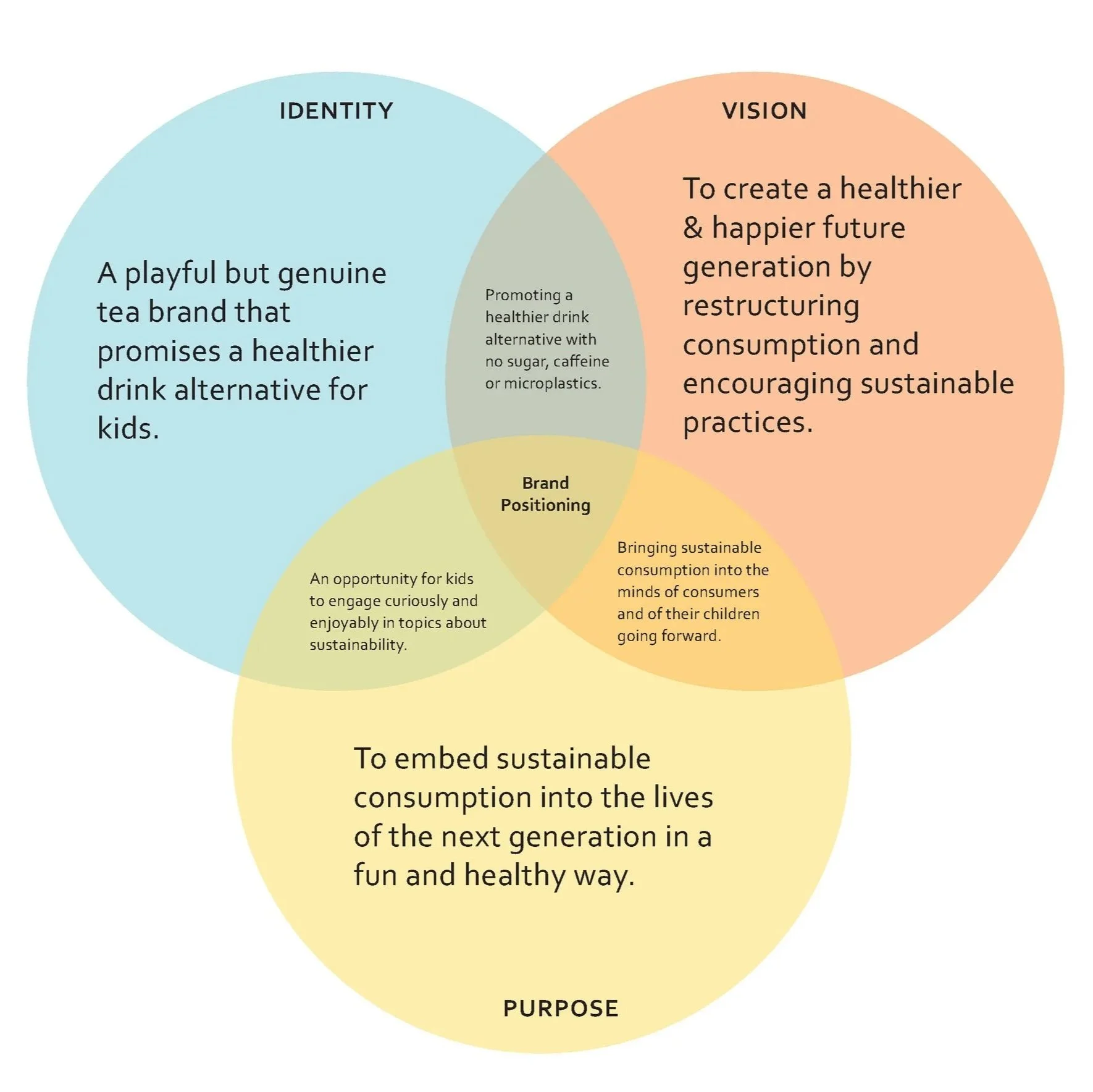
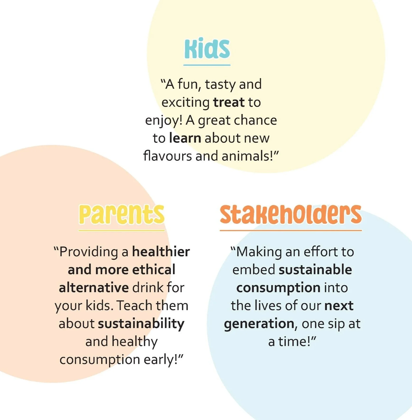
Market Analysis & Positioning
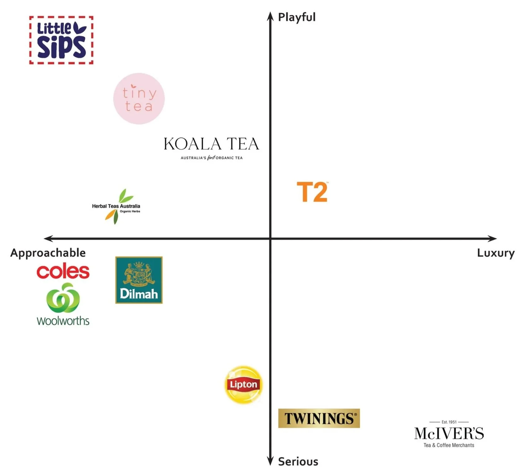
Early in the process we conducted research into the market positioning of Little Sips in comparison to other popular tea brand in the Australian market.
These were measured on a scale from serious to playful, as well as approachable to luxury. We believe that these values best reflect the values of the Australian tea community when buying tea and allow us to discover what they are truly looking for in the supermarket aisle.
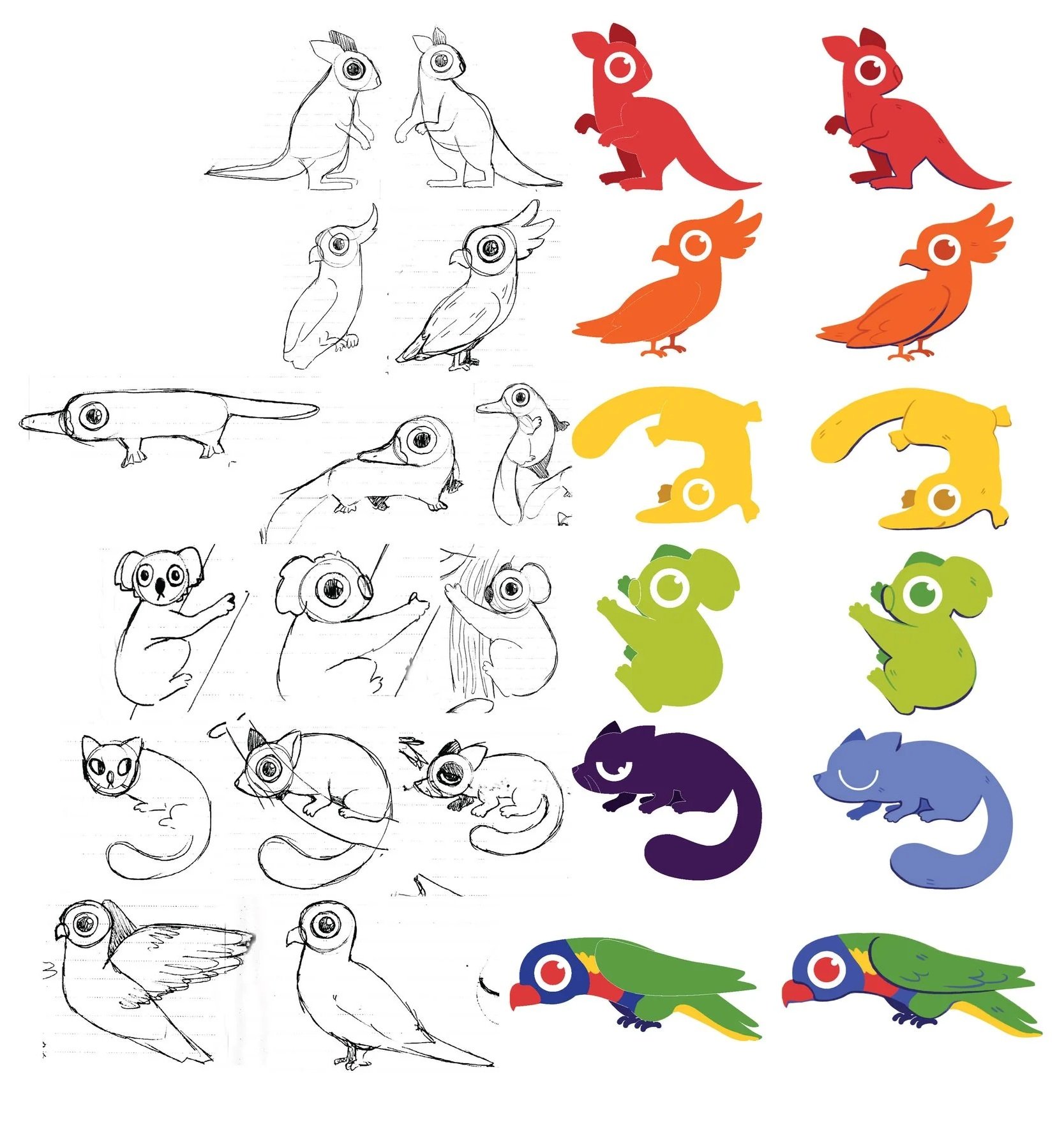
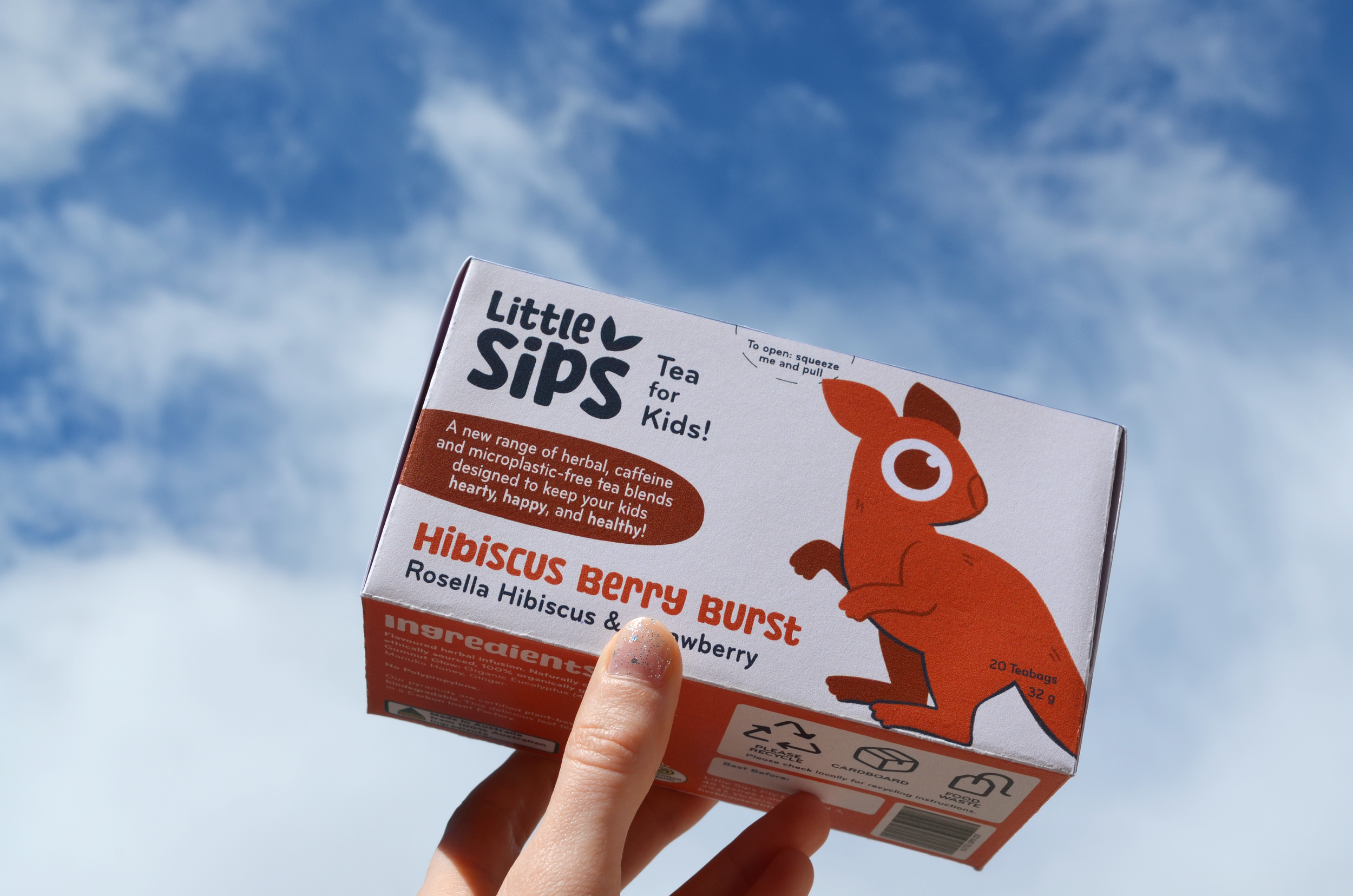
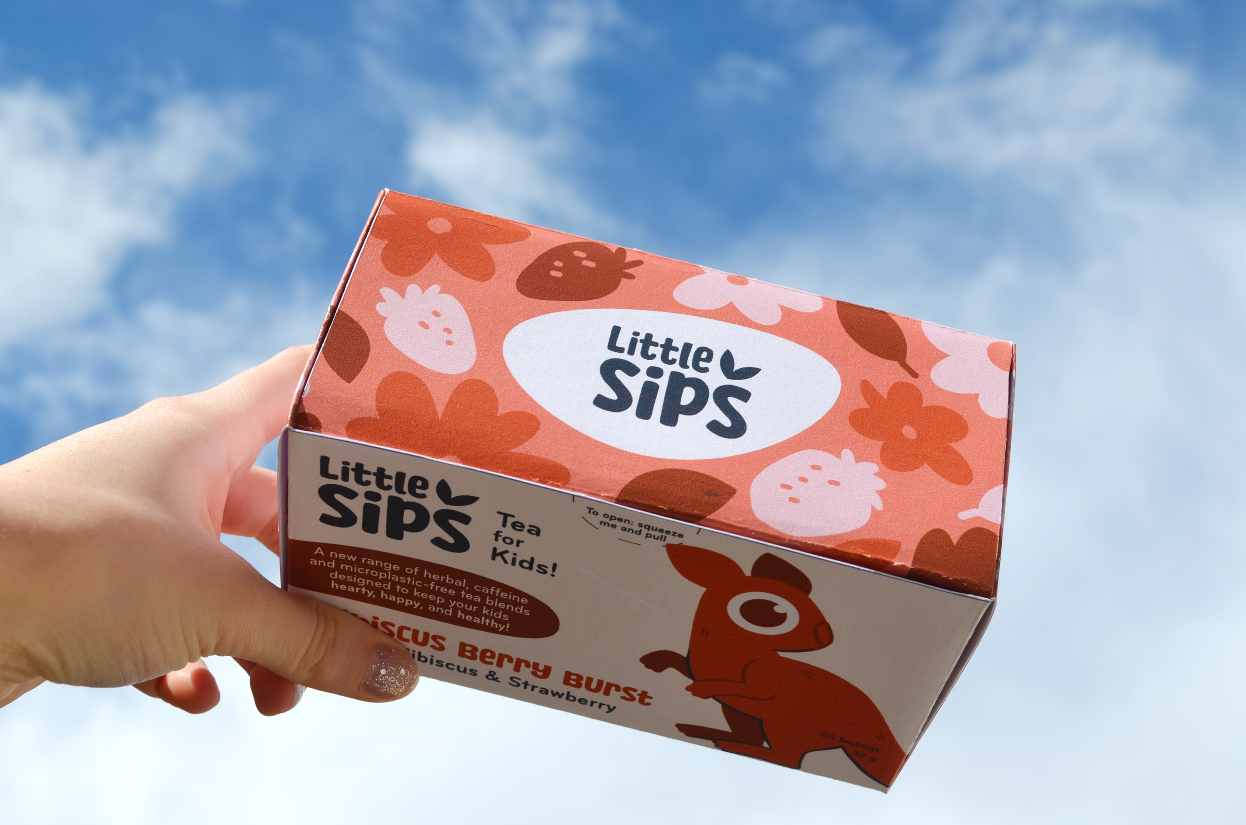
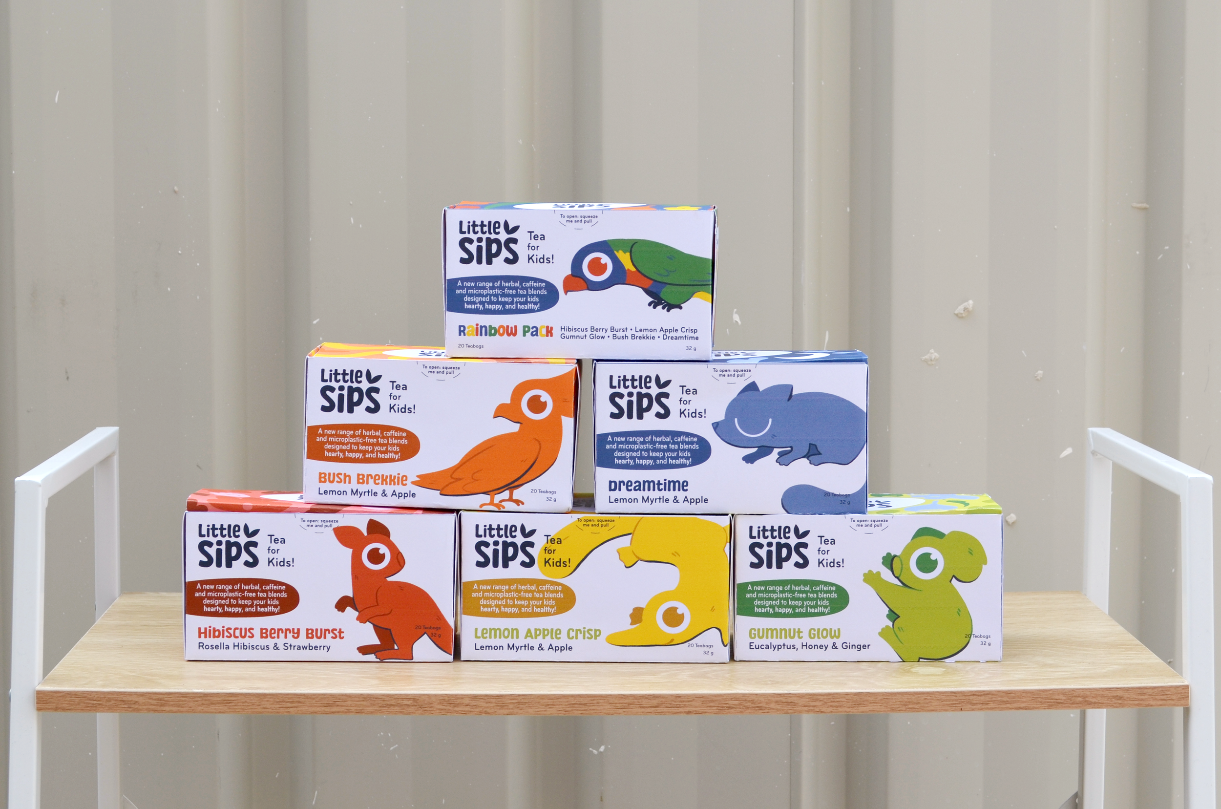
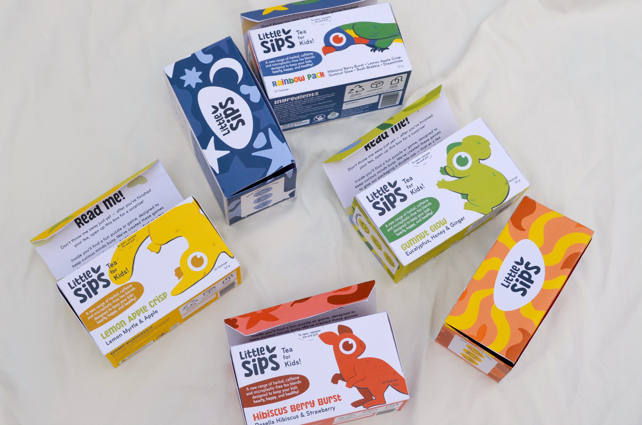
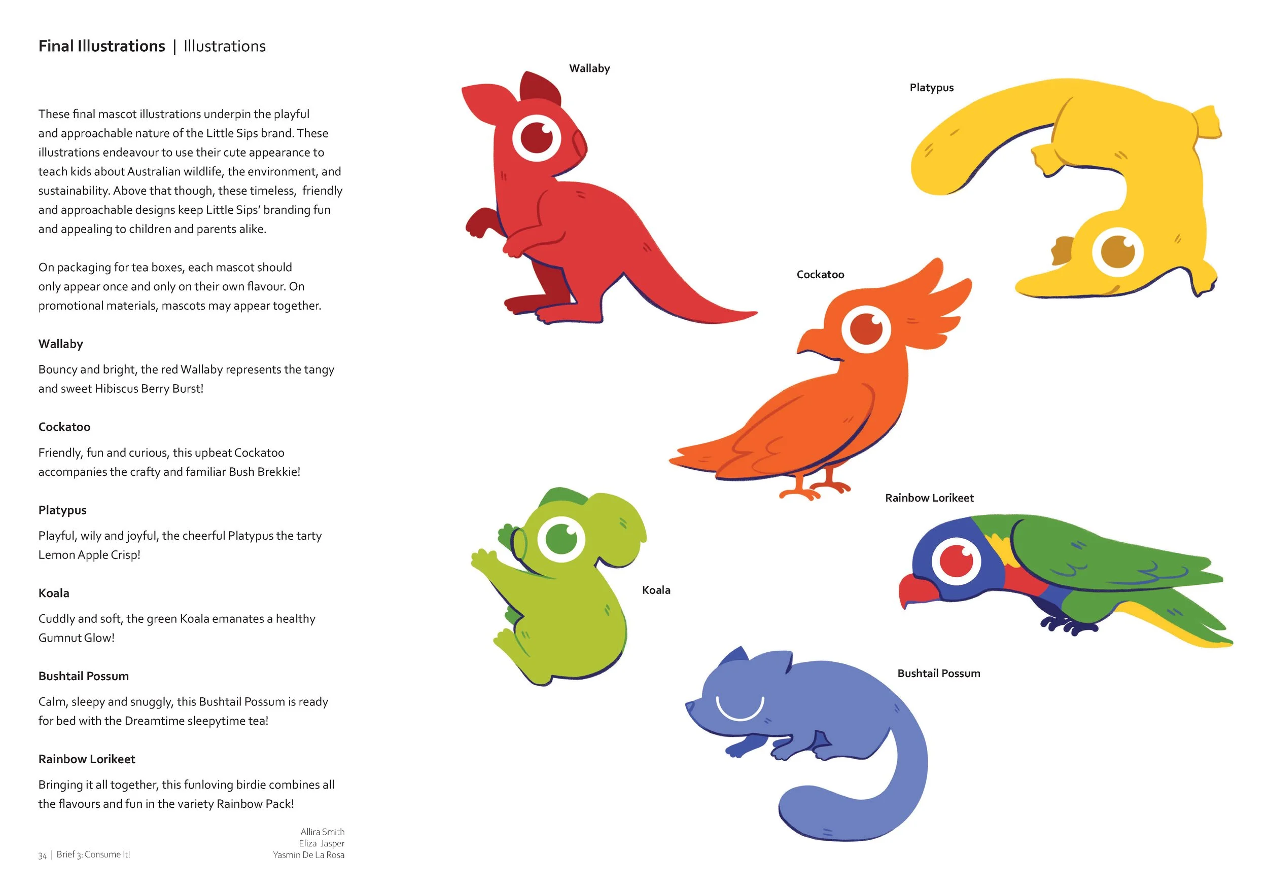
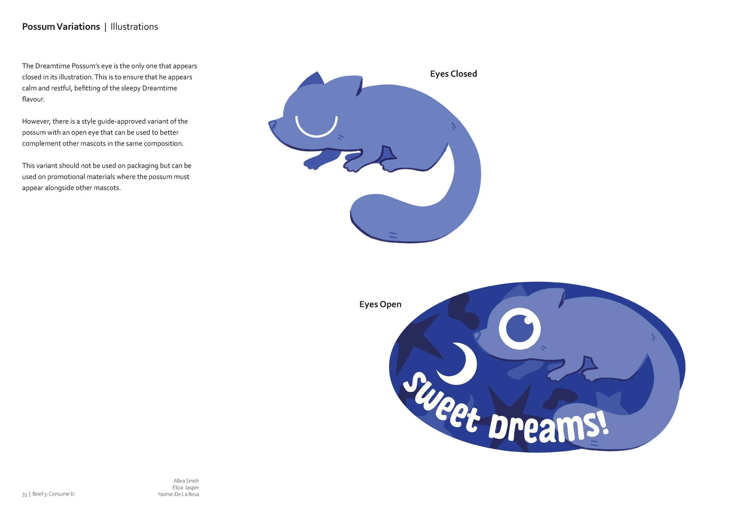
Mascot Development & Illustration
The refinement process for the mascots was relatively simple - beginning with concept sketches that studied references based on pose, character and shape language, the style with the large central eye was quickly defined. Clear in the progress sketches though, you can see early iterations included a slightly different style.
I was responsible for the development, illustration, and digitisation of these colourful mascot characters.


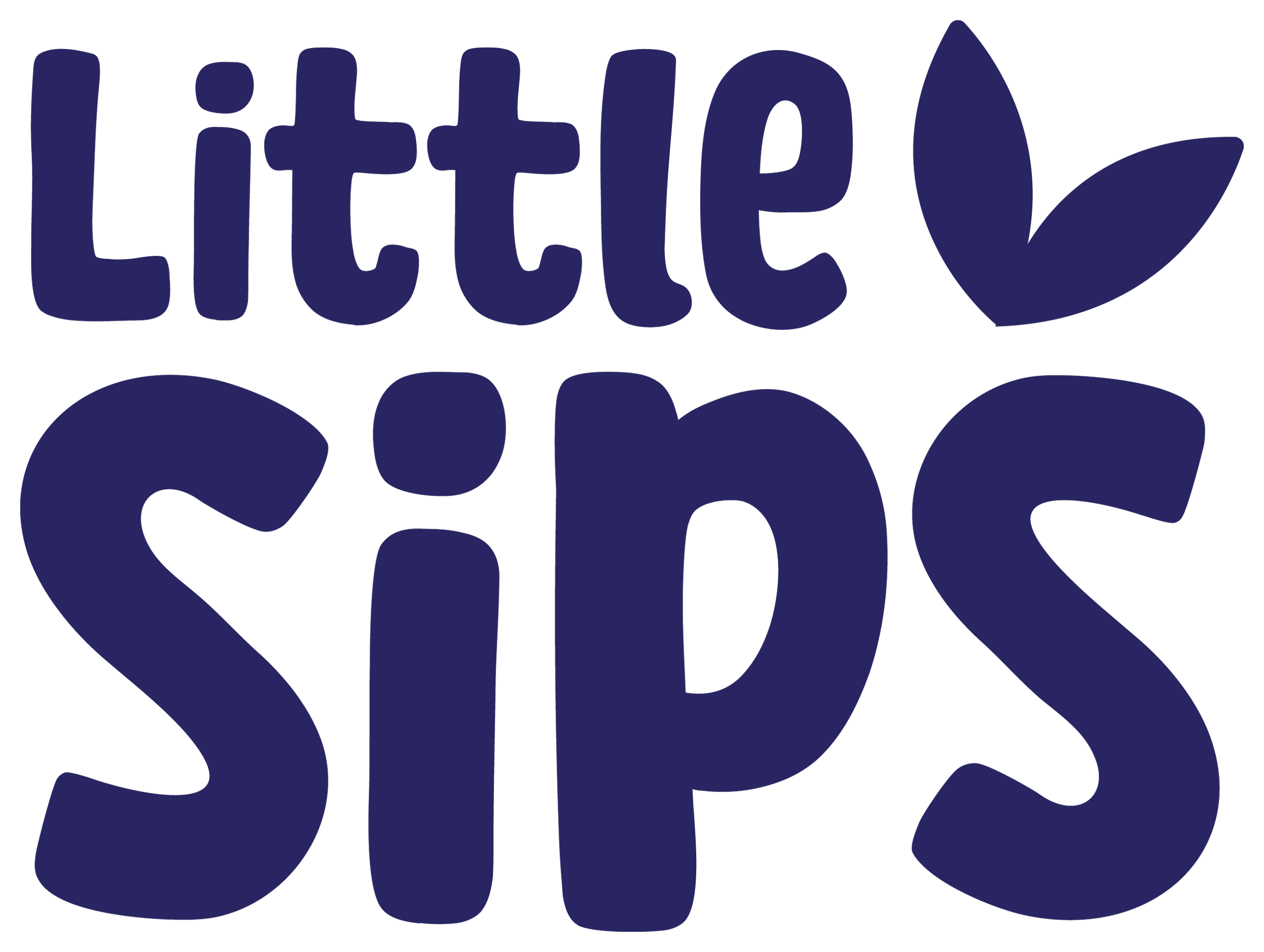
Logo Development
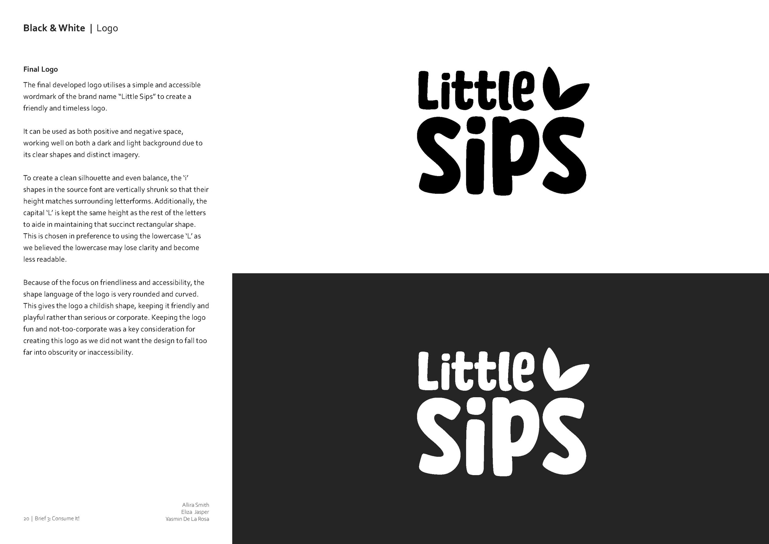
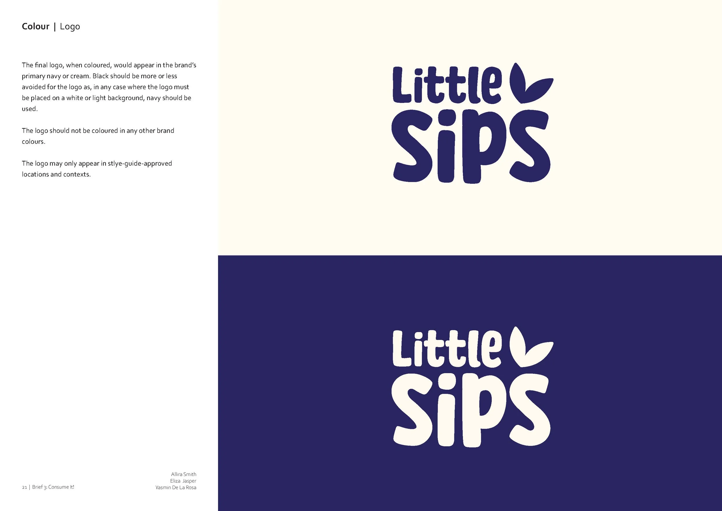
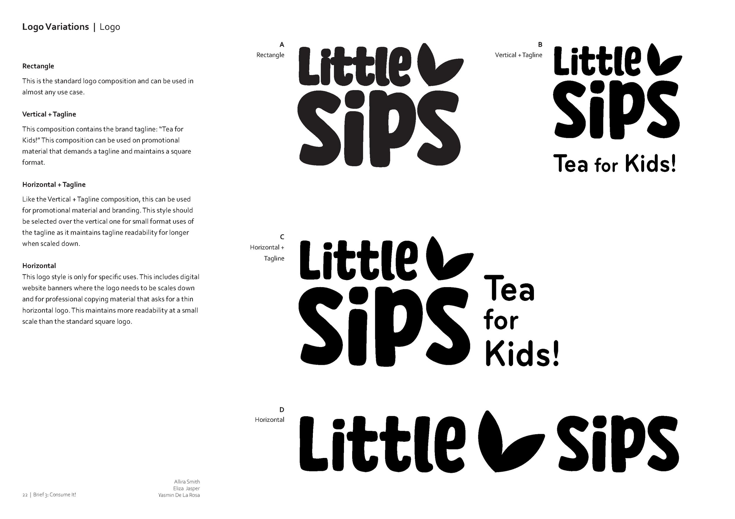
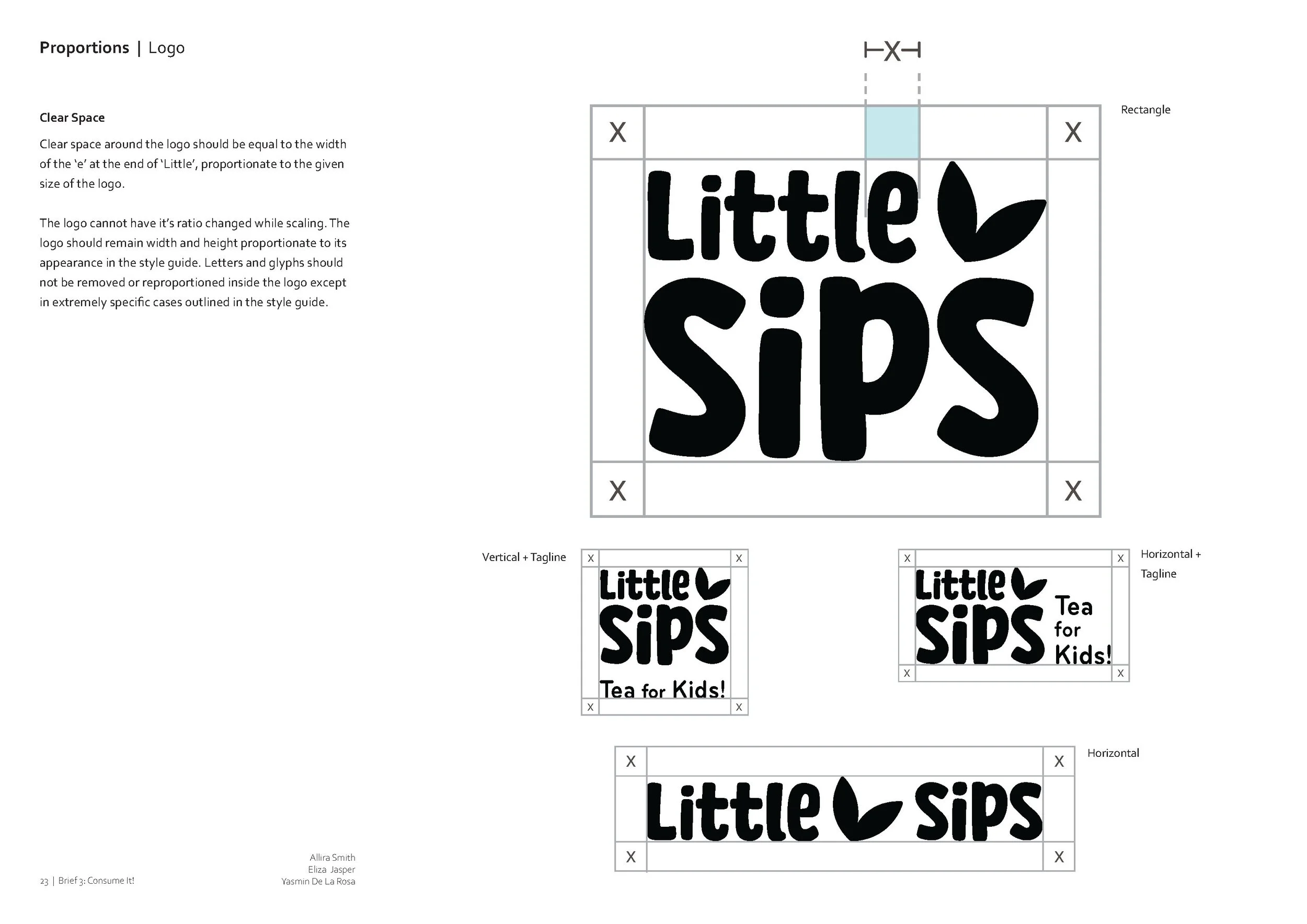
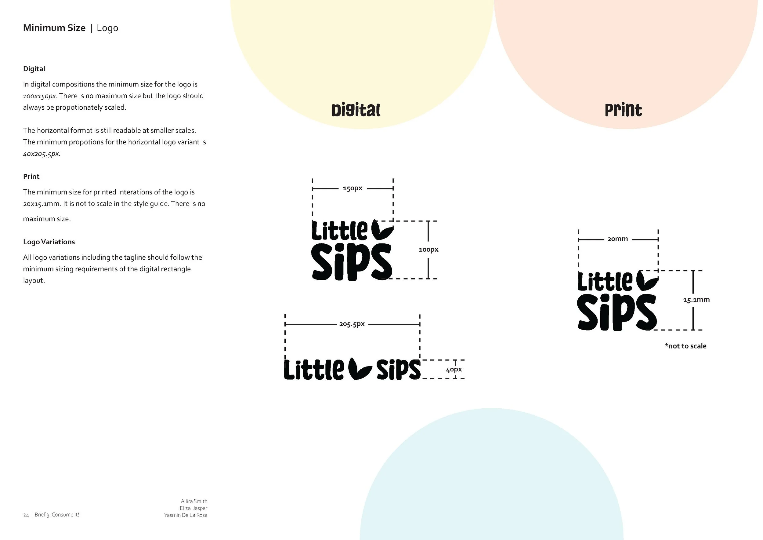
The final developed logo utilises a simple and accessible wordmark of the brand name “Little Sips” to create a friendly and timeless logo.
Because of the focus on friendliness and accessibility, the shape language of the logo is very rounded and curved. This gives the logo a childish shape, keeping it friendly and playful rather than serious or corporate. Keeping the logo fun and not-too-corporate was a key consideration for creating this logo as we did not want the design to fall too far into obscurity or inaccessibility.
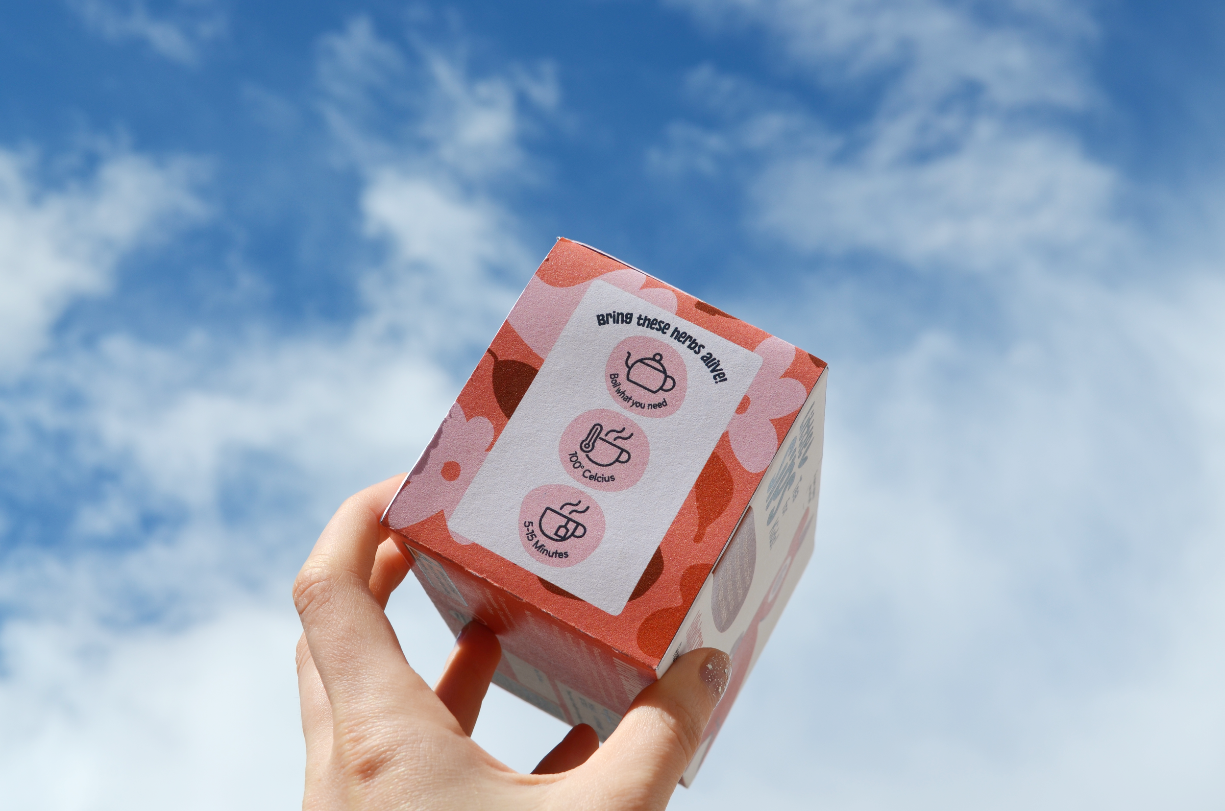
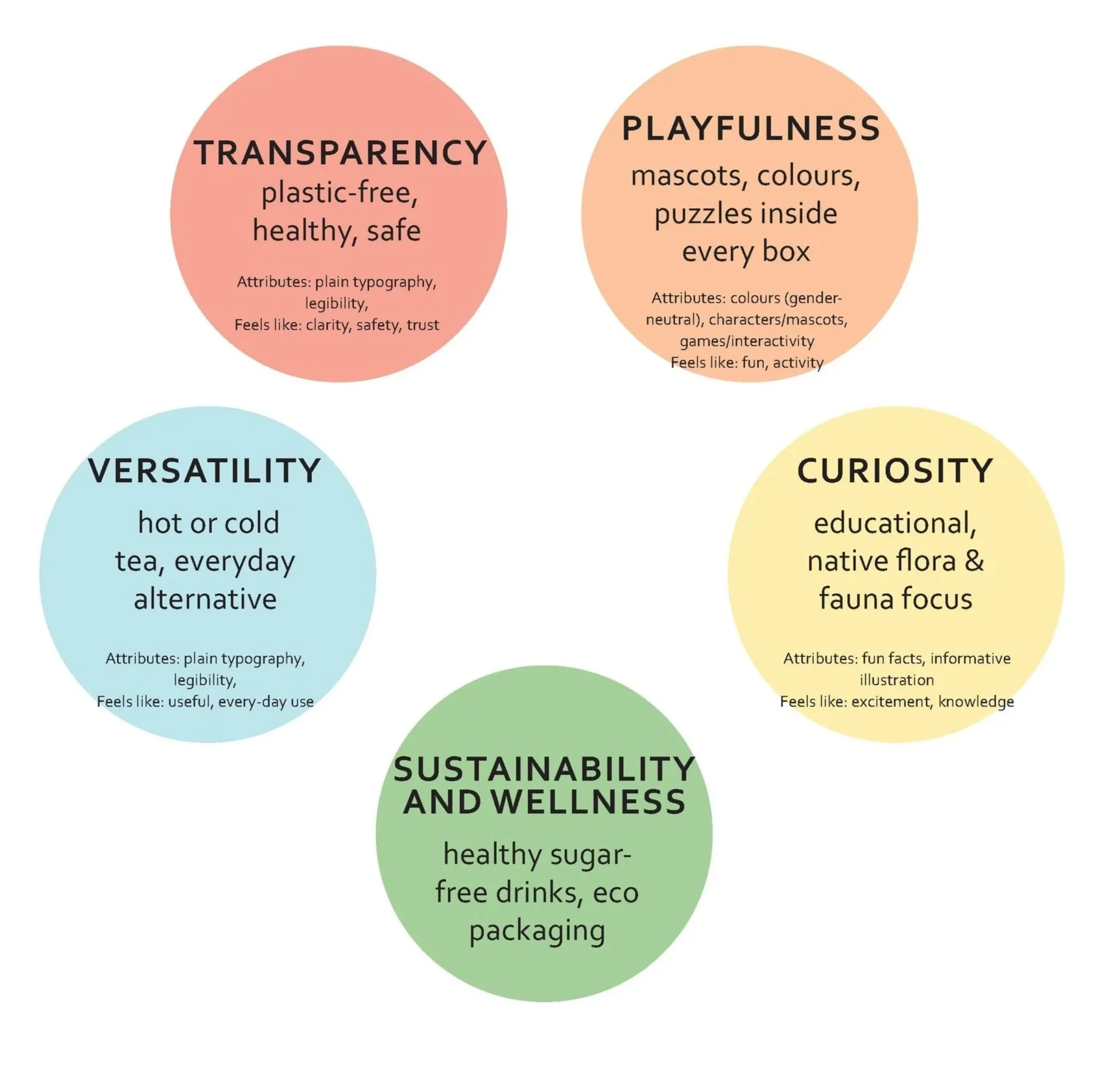
Style Guide
Creating a style guide for Little Sips involved accumulating all the developmental products finalised thus far to create a comprehensive and immersive document outlining the exact branding guidelines for our new tea company. As a designer who enjoys detail-oriented tasks, this was one of the most enjoyable parts of the project.


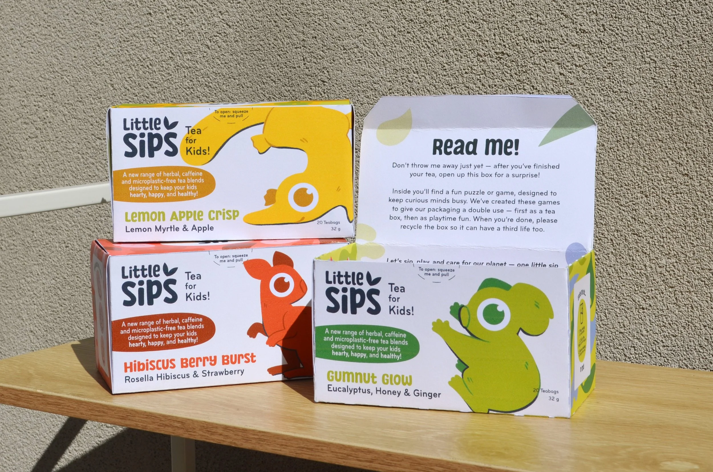
Finished Packaging